What’s Inside
- Color Drenching Your Navy Blue Living Room Decor
- Always Test Your Swatches First
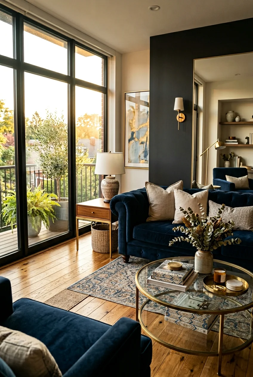
- The Velvet Sofa Investment
- Budget-Friendly Navy Seating
- Layering Warm Brass Metallics
- Grounding with Chunky Jute Rugs
- Adding Mustard and Blush Accents
- Pick Your Fabrics Before You Paint
- Measure Your Furniture Obsessively
- Creating a Blue Gradient Effect
- Highlighting Art Against Dark Walls
- Hanging Velvet Navy Curtains
- Layered Lighting is Non-Negotiable
- Ditching the Tiny Clutter
- Painting Your Interior Doors Navy
- Adding Woven Rattan Accents
- Tying Your Navy Blue Living Room Decor Together
I ruined my first apartment by painting the walls a cheap, chalky blue that looked like a bruised blueberry. Nailing the perfect navy blue living room decor takes way more than just slapping dark paint on drywall. I’m Olivia, and I’ve spent the last six years figuring out how to make dark rooms feel cozy instead of like a damp cave. Let’s fix your space.
1. Color Drenching Your Navy Blue Living Room Decor

Color drenching means painting the walls, trim, and ceiling the exact same color. I tried this last October in my own house. I used Benjamin Moore’s Hale Navy HC-154. It costs about $75 per gallon. The first coat looked terrifying. It was streaky and smelled like wet dog. But after the second coat, the room felt like a cozy hug. Hale Navy has a rich maritime feel that acts like a neutral. Skip the cheap builder-grade paints. They dry patchy. I learned that the hard way when I tried to save money on my guest room. If you’re scared of painting the ceiling, don’t be. White ceilings with dark walls look like a floating lid. Drenching hides weird architectural quirks perfectly. Just make sure you buy high-quality rollers. I bought a 3-pack of cheap foam rollers from Walmart for $4.99 and they left little chunks of fuzz stuck in my expensive paint. Never again.
2. Always Test Your Swatches First

Most people get this wrong. You can’t just tape a tiny paper square to your wall and call it a day. You need to paint a real 4×4 inch swatch directly on the drywall. Apply two to three coats. I skipped this step last Tuesday. I bought a gallon of Sherwin-Williams Naval SW 6244 for $80 without testing it. In my living room, the afternoon sun made it look almost purple. I was furious. Lighting completely changes dark colors. You need to look at the paint swatch at 8 AM, noon, and 8 PM. I actually spilled a glass of Trader Joe’s Charles Shaw Cabernet (the $3.99 bottle) right next to my baseboard while staring at a swatch one night. The wine stain was practically the same color as the paint in that dim light. That’s when I realized I needed a navy with stronger gray undertones to ground the space. Take the time to test. It saves you tears later.
3. The Velvet Sofa Investment

A navy velvet sofa is the ultimate anchor piece. It completely changes the room. I personally swear by the Albany Park Kova Sofa. The 122-inch version costs about $2,490. It has this cloud-like comfort that makes you never want to stand up again. Velvet sounds high-maintenance, but it’s actually incredibly durable. I spilled half a 16 oz cup of iced coffee from Whole Foods on my friend’s velvet couch last month. But the liquid just beaded up on the surface. I wiped it away with a dry paper towel in seconds. No stain. The texture catches the light beautifully, giving the dark blue so much depth. Don’t buy cheap microfiber pretending to be velvet. It feels like a dusty car seat. I bought a knock-off velvet chair once for $150 and it attracted every piece of lint in a ten-mile radius. Invest in good upholstery. You’re going to sit on it every single day.

UTTCMK Bookshelf Decor Thinker Statue
UTTCMK Bookshelf Decor Thinker Statue – Abstract Art Reading Thinker S has been one of the most consistently praised picks in this category. 809 reviewers averaged 4.5/5.
4. Budget-Friendly Navy Seating

If you can’t drop three grand on a sofa right now, you still have great options. IKEA’s Ektorp sofa in navy is a solid choice. It costs around $599. I had one in my second apartment. It offers that classic Scandinavian look and the frame is surprisingly sturdy. The best part is the removable slipcover. You can literally throw it in the washing machine. I washed mine with 1/2 cup of standard Tide detergent every few months. It faded slightly over three years, but it gave it a nice worn-in denim look. The seat cushions are a bit stiff at first. You’ve got to break them in. I spent a whole weekend binge-watching TV just to soften the foam. If you go this route, buy new legs. I bought a set of 4 wooden tapered legs from Amazon for $25.99. It made the cheap sofa look like a custom piece from a boutique. It’s a simple trick that works every time.
5. Layering Warm Brass Metallics

Navy absorbs a lot of light. You’ve got to balance it with warm metallics. Silver or brushed nickel just looks cold and corporate against dark blue. I exclusively use brass or gold. I bought the West Elm Mid-Century Staggered Glass Floor Lamp in the antique brass finish. It costs $349. The metallic finish adds so much warmth to the corner of my room. The contrast between the shiny brass and the matte navy walls is stunning. Don’t overdo it, though. You don’t want your room looking like a pirate’s treasure chest. I bought a cheap, shiny gold tray from Target for $15 last year. It was so overly glossy that it looked like cheap plastic next to my nice lamp. I threw it in the donation bin a week later. Stick to brushed or antique brass finishes. They look expensive and grounded. I also swapped out my basic light switch plates for brushed brass ones. They cost $6.50 each at Home Depot. You might also like: 15 Lovely Cozy Home Decor Ideas to Steal Right Now
6. Grounding with Chunky Jute Rugs

You need natural textures to keep the room from feeling too heavy. Navy is a bold color. It needs something earthy to ground it. I absolutely love the Pottery Barn Chunky Jute Rug. A 5×7 foot size costs about $249. The woven texture feels amazing under bare feet. It adds this casual, organic vibe that breaks up the seriousness of dark walls. Jute does shed at first. For the first two weeks, I was vacuuming up little brown fibers constantly. It drove me crazy. But it eventually stopped. Don’t buy the ultra-thin jute rugs. They bunch up under your furniture and look messy. You need the thick, chunky weave. I once bought a thin natural fiber rug from Costco for $99. It curled at the edges so badly that I tripped over it while carrying a 12 oz bowl of hot soup. The rug went straight in the trash. Spend the extra money on a heavy, chunky weave. You might also like: 20 Creative Cozy Farmhouse Decor Ideas That Actually Work

Farmhouse White Fake Decorative Books for Home Office Decor
If you want something that just works, Farmhouse White Fake Decorative Books for Home Office Decor – Religion is a safe bet (10 reviews, 4.5 stars).
7. Adding Mustard and Blush Accents

Navy pairs perfectly with bright neutrals, but you need a pop of unexpected color. Mustard yellow and blush pink are my absolute favorites. A mustard armchair against a navy wall creates this amazing, playful contrast. I found a gorgeous mustard velvet pillow cover on Etsy for $32. It completely woke up my dark sofa. Blush pink is great if you want a softer look. It brings out the dusty gray tones in the blue paint. I bought two 20×20 inch blush linen pillows from Crate and Barrel for $49.95 each. They look incredible. Don’t mix too many bright colors, though. I tried adding bright red and Kelly green into the mix once. My living room looked like a primary school classroom. Stick to one or two accent colors. I also keep a fresh bunch of eucalyptus in a vase on my coffee table. I bought a bundle at Sprouts for $4.99 last Friday. The muted green leaves look so elegant against the dark blue backdrop. You might also like: 15 Stunning Aesthetic Home Decor Ideas You Need to See
8. Pick Your Fabrics Before You Paint

This is the biggest mistake I see people make. Never pick your paint color first. It’s totally backwards. You need to select your essential fabrics before you even look at a paint deck. I’m talking about your rugs, pillows, draperies, and upholstery. It’s so much easier to find a navy paint that matches a specific rug than it’s to find a rug that perfectly matches your freshly painted walls. I ruined my first house doing this. I painted the walls a stunning dark blue. Then I spent six months trying to find a patterned armchair that didn’t clash with it. I ended up buying a custom-upholstered chair for $850 that still looked slightly off. Start with your textiles. If you fall in love with a floral curtain panel that features a specific shade of navy in it, take that fabric straight to the paint store. They can color-match it perfectly. It saves you so much frustration and wasted money.
9. Measure Your Furniture Obsessively

Dark colors make a room feel cozier, but they also make large furniture look even heavier. You’ve got to measure everything. I bought a massive oversized leather chair from Costco once. It was an impulse buy for $450. I didn’t measure it. When I got it home, it blocked half the walking path in my living room. I stubbed my toe on it every single morning. I had to sell it on Facebook Marketplace for half the price. If you’re looking at something like the West Elm Eddy Navy Blue Sofa, check the specs. It’s exactly 82 inches wide, 33 inches high, and 34 inches deep. Get a roll of blue painter’s tape. Tape those exact dimensions onto your floor. Walk around it. See how it feels. Leave the tape down for at least 48 hours. If it feels cramped, you need a smaller piece. Navy furniture is visually heavy. You need to leave plenty of negative space around it so the room can breathe.

Govee RGBIC Floor Lamp Basic
A dependable everyday pick — Govee RGBIC Floor Lamp Basic pulls in 107 ratings at 4.5 stars. Not flashy, just solid.
10. Creating a Blue Gradient Effect

Flat, single-tone rooms are boring. You want to create a blue gradient for depth. This means layering different shades of blue from darkest to lightest. It creates a calming, sophisticated flow. I painted my main accent wall a deep Midnight Blue (specifically hex code #021024). It’s almost black in the evening. Then, I layered lighter blues throughout the room. I bought a chunky knit throw blanket in a Dusty Blue (hex code #7DA0C4) for $65 from a local boutique. The contrast is beautiful. It makes the space feel intentional and designed. I tried to use all the exact same shade of navy once. I matched the walls, the sofa, and the curtains perfectly. The room felt like a dark, suffocating box. You need the variation in tone to give your eyes a break. I even added a pale blue ceramic vase I found at Kroger for $12.99. It sits on my dark wood console table and catches the light perfectly.
11. Highlighting Art Against Dark Walls

Navy is the absolute best backdrop for vibrant artwork. White walls wash out colorful pieces. Dark walls make them explode. I painted a small gallery wall section in Benjamin Moore’s Bold Blue 2064-10. A quart cost me $28. It’s a very dramatic, saturated shade. I hung a large 24×36 inch abstract canvas with bright yellows and reds right in the center. The colors practically vibrate off the wall. You’ve got to be careful with your frames, though. I used cheap black plastic frames from Walmart at first. They cost $8 each. They completely disappeared against the dark blue paint. It looked terrible. You need contrast. I swapped them out for thin, brushed gold frames from Target. They were $22 each. The metallic edge separates the art from the dark wall and makes it look like a high-end gallery. Don’t be afraid to hang really bright, weird art on your navy walls. The dark background handles the crazy colors perfectly.
12. Hanging Velvet Navy Curtains

If you aren’t ready to paint your walls, use curtains. Floor-length navy velvet curtains give you that moody vibe without the commitment of paint. When you draw them closed, they create a solid wall of dark blue. I bought the custom velvet panels from West Elm. They cost about $140 per 96-inch panel. They are heavy, lined, and absolutely gorgeous. They block out the harsh afternoon sun and keep the room cool. Don’t buy unlined cheap velvet curtains. I ordered a set online for $35 once. When the sun hit them, you could see right through the fabric. You need the heavy, lined panels for them to hang correctly. Make sure you hang the curtain rod high and wide. I mount my rod exactly 2 inches below the ceiling line. It makes the ceilings look taller. I used a 1-inch thick matte black iron rod from Amazon that cost $45. The heavy velvet needs a sturdy rod, otherwise it bows in the middle.

Homedics Tabletop Water Fountain
Homedics Tabletop Water Fountain punches above its price — 44 buyers rated it 4.5 stars. I would buy it again.
13. Layered Lighting is Non-Negotiable

Dark walls eat light. You can’t just rely on a single ceiling fixture. You need layered lighting. This means a mix of overhead lights, floor lamps, and table lamps. I put everything on dimmer switches. I bought a Lutron LED dimmer switch from Home Depot for $29.97. It took me 20 minutes to install. Being able to lower the overhead light changes the whole mood of the room. I also own a small ceramic table lamp on my side table. I put a 40-watt equivalent warm white LED bulb in it. It casts this beautiful, soft glow against the navy paint. I once bought a pack of cheap daylight LED bulbs from a hardware store. They had a terrible blue tint. When I turned them on, my cozy navy living room looked like a sterile hospital cafeteria. I threw the whole 4-pack in the trash. Always buy bulbs labeled soft white or warm white (around 2700K). They make the dark blue feel rich and inviting.
14. Ditching the Tiny Clutter

A dark room feels messy much faster than a light room. You’ve got to edit your accessories. Don’t clutter your surfaces with a dozen tiny trinkets. It looks chaotic against the bold wall color. Opt for fewer, larger statement pieces. I cleared off my entire coffee table last month. I replaced a bunch of small candles and coasters with one massive decorative bowl from West Elm. It cost $85. It’s made of textured white ceramic and it’s 14 inches wide. It commands attention and breaks up the dark space perfectly. I used to buy lots of cheap little knick-knacks. I owned a shelf full of tiny $5 ceramic birds and fake succulents. Dusting them was a nightmare. Plus, they just looked like visual noise against the navy paint. Now, I stick to big, impactful items. I own one large coffee table book (12×15 inches) and the ceramic bowl. That’s it. The room feels so much more sophisticated and breathable now.
15. Painting Your Interior Doors Navy

This is a surprising trick that adds instant architectural interest. Instead of painting the walls, paint your interior doors a deep navy. I did this to my living room coat closet door. I used a quart of Sherwin-Williams Naval in a satin finish. It cost about $32. The dark door against my white walls looks incredibly chic. It hides dirty fingerprints perfectly, too. I used to scrub that white door weekly with a Mr. Clean Magic Eraser. Now, I just wipe it with a damp microfiber cloth once a month. Make sure you prep the door properly. I skipped sanding on my first try. I just painted right over the old glossy white paint. Three days later, the navy paint started peeling off in long, rubbery strips. I had to scrape it all off, sand the door down with 120-grit sandpaper, and start over. Take the time to sand and prime. The final result is absolutely worth the extra elbow grease.

Lazebox Coasters Set of 8 for Drinks
Lazebox Coasters Set of 8 for Drinks punches above its price — 17 buyers rated it 4.5 stars. I would buy it again.
16. Adding Woven Rattan Accents

Rattan is the perfect material to pair with navy. It brings in that earthy, natural texture that stops the room from feeling too formal. I bought a beautiful rattan accent chair from Target’s Opalhouse line. It was $250. The light, woven wood looks incredible sitting next to my dark velvet sofa. It adds this breezy, coastal vibe without looking like a beach house cliché. Rattan can be a bit stiff to sit on, though. You definitely need a cushion. I bought a 2-inch thick white linen seat cushion for $35 to make it comfortable. I also added a large woven rattan basket next to my TV console. I use it to hold extra blankets. It cost $45 at World Market. I once tried to use dark espresso wood furniture with my navy walls. It was a terrible mistake. The room felt incredibly heavy and depressing. You need light, natural woods like rattan or pale oak to lift the space and provide contrast.
17. Tying Your Navy Blue Living Room Decor Together

Throw pillows are the easiest way to pull your navy blue living room decor together. You can’t just throw solid blue pillows on a solid blue sofa. You need pattern and texture. I mix a large-scale print with a smaller geometric pattern. I bought two 22×22 inch floral block-print pillows from Etsy for $45 each. They feature navy, mustard, and cream in them. They tie all the colors in the room together perfectly. Always buy feather down inserts. I buy the 24×24 inch inserts from Amazon for $18 each. You want the insert to be 2 inches larger than the cover so it looks plump. I used to buy cheap polyester-filled pillows from grocery stores. I grabbed two for $10 at Kroger once. Within a month, they were flat, lumpy, and sad. Spend the extra money on down inserts. You can karate-chop the top of them and they hold their shape beautifully. It makes the whole room look high-end.
Designing a dark space doesn’t need to be intimidating. You just need the right textures, good lighting, and a little bit of patience. I’m obsessed with how my living room looks now, and I know these tricks will work for you too. Pin this post for later so you don’t forget those paint colors when you head to the hardware store!
Frequently Asked Questions
What is the best navy blue paint color for a living room?
Benjamin Moore’s Hale Navy (HC-154) is a top choice because it acts as a rich, maritime neutral. Sherwin-Williams’ Naval (SW 6244) is another excellent option with subtle gray undertones that ground the space beautifully.
What accent colors go best with navy blue walls?
Navy pairs perfectly with warm metallics like brass or gold. For fabric accents, mustard yellow, burnt orange, and blush pink create a stunning, playful contrast against the dark, moody blue background.
Does navy blue make a living room look smaller?
Dark colors can visually close in a room, but they also blur the boundaries of the walls, making the space feel cozier and endless. Proper layered lighting and warm metallic accents are essential to prevent the room from feeling cramped.
Should I paint my ceiling navy blue too?
Yes, this technique is called color drenching. Painting the walls, trim, and ceiling the same navy hue creates a sophisticated, enveloping feel and prevents a white ceiling from looking like a stark, floating lid.
