What’s Inside
- Embrace “Transformative Teal” for a 2026 Vibe
- Opt for Light, Airy Blues for a Calming Atmosphere
- Layer Blue Tones for Depth Without Monotony
- Warm Up the Space With Specific Lighting
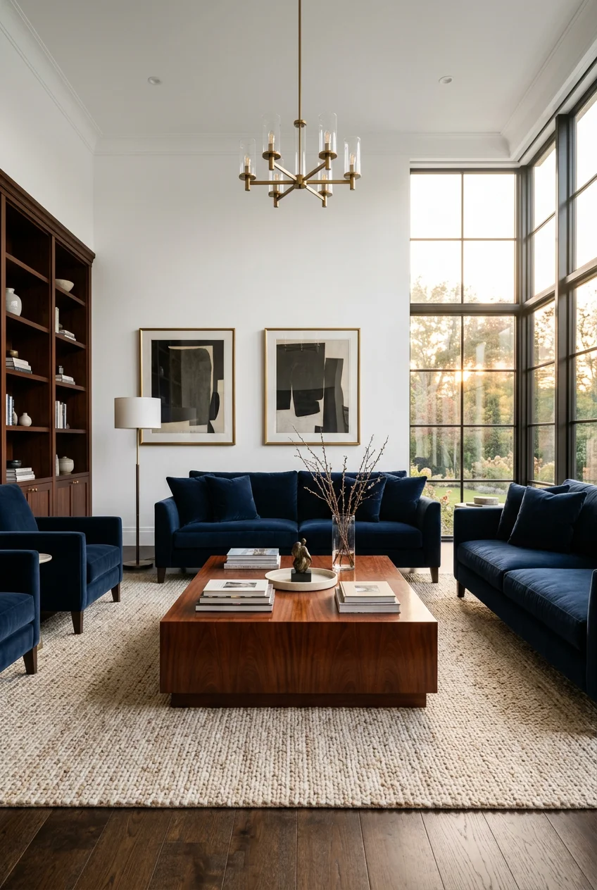
- Anchor the Room With a Blue Statement Sofa
- Avoid the Mistake of Clashing Patterns
- Layer Cozy Textures With Throws and Pillows
- Balance Blue With Warm Neutrals and Metals
- Try a “Blue Gradient” Approach for Your Walls
- Introduce Blue Through Chic Accent Chairs
- Hang Your Artwork at the Correct Height
- Don’t Overlook Blue for Architectural Details
- Anchor the Space With a Patterned Blue Area Rug
- Pair Blue With Unexpected Colors for a Modern Twist
- Avoid Bright White Trim With Warm Blue Tones
- Use Plants to Breathe Life Into Blue Spaces
I tried painting my first apartment’s living room a bold cobalt. It didn’t look like a cozy oasis; it looked like a Smurf exploded. My eyes hurt after sitting on my cheap futon for ten minutes. Figuring out how to do blue decor right took me years of trial and error, a mountain of returned Home Depot paint cans, and some real blunders. I learned the hard way. I’m Olivia, and I’m going to show you how to nail this look without the headaches. Blue can be calming, but it turns into a sterile doctor’s office if you don’t balance it. We’ll cover everything from the right lightbulbs to the specific paint shades that won’t ruin your life. Let’s fix those cold, boring spaces and make something beautiful.
1. Embrace “Transformative Teal” for a 2026 Vibe

Let’s start with a color taking over my Pinterest feed. WGSN named “Transformative Teal” their Color of the Year for 2026. I’m obsessed. It’s a deep, moody teal-green that blends the calm of blue with the grounding feel of green. Last Tuesday at Target, I almost bought a $150 velvet ottoman just because it was this exact shade. You can easily pull this into your space with a statement piece. Think a rich velvet armchair or painting one solid accent wall behind your 65-inch TV. I painted my own media wall a similar dark teal last month. The paint had a sharp, chemical smell, but the finish is stunning. It anchors the room. If you’re scared of dark colors, start small. A 5×7 foot area rug from Rugs USA in this dark teal (usually around $89.99) adds enough drama without swallowing your natural light. Don’t paint the whole room this color, though. It’s too heavy for four walls.
2. Opt for Light, Airy Blues for a Calming Atmosphere

Sometimes you just want your home to feel like a giant exhale. Designers are leaning into soft, airy blue paint colors for 2026. I’m talking shades like Behr’s “Aerial View” (around $39.98 a gallon) or Valspar’s “Encore” (usually $44.98 at Lowe’s). These aren’t baby blues. They have subtle gray undertones that keep them from looking like a toddler’s nursery. I painted my guest room “Aerial View” last spring. The roller felt like it was gliding on clouds, and the fresh paint smell was weirdly satisfying. It instantly made the 10×10 foot room feel twice as big. If you want a serene backdrop for your blue living room, this is the way to go. Just be warned: light blue shows scuff marks easily. I learned this when my golden retriever dragged a muddy stick along my brand new baseboards. Keep a Magic Eraser (a 4-pack is about $5.49 at Kroger) handy if you have pets or kids.
3. Layer Blue Tones for Depth Without Monotony

Please don’t paint your walls navy, buy a navy couch, and throw navy pillows on it. You’ll feel like you’re drowning in the deep end. Instead, layer your blues to create interest. Pair pale sky blue walls with a rich midnight blue armchair. This layering trick adds depth, which is helpful if you have a narrow, bowling-alley style living room. I tried the monochromatic thing in 2018. I bought a matching blue rug, curtains, and sofa. It was a disaster. The room felt flat and lifeless. Now, I mix it up. I have a light blue 50×60 inch throw blanket ($24.99 from HomeGoods) draped over a dark indigo denim chair. The contrast makes both colors pop. You want your eyes to bounce around the room, picking up different shades. It’s like wearing a light wash denim jacket with dark wash jeans. It just works better when the tones are different.

Farmhouse White Fake Decorative Books for Home Office Decor
Farmhouse White Fake Decorative Books for Home Office Decor – Religion punches above its price — 10 buyers rated it 4.5 stars. I would buy it again.
4. Warm Up the Space With Specific Lighting

Blue is a cool color. If you use the wrong bulbs, your living room will feel like a sterile dentist’s office. Skip the “daylight” bulbs entirely. They make blue walls look icy and cheap. Instead, use warm lighting to balance the cool tones. Expert Lucy at Arighi Bianchi recommends ambient wall sconces and lamps with warm white bulbs. You specifically want bulbs labeled 2700-3000K. I buy the GE Relax LED 4-packs at Walmart for about $9.84. They bring a gorgeous, cozy glow that makes the blue feel inviting. You should aim for about 350-400 lux in your seating areas for comfort. I learned this after buying cheap 5000K bulbs off Amazon. I flipped the switch and my beautiful blue walls looked like a fluorescent parking garage. No exaggeration. I boxed them back up ten minutes later. Warm lighting is the secret ingredient that makes a blue room comfortable at night.
5. Anchor the Room With a Blue Statement Sofa

A blue sofa is a massive commitment, but it’s worth it for a focal point. It anchors the entire space. I’m currently drooling over the Albany Park “Kova Sofa.” Depending on the configuration, it runs between $2,000 and $3,000. It has this incredible cloud-like comfort that makes you want to cancel plans and nap all day. If you have kids or a cat with sharp claws, you might want something tougher. The Burrow “Nomad Sofa” (around $1,500 to $2,500) is fantastic because it uses scratch-resistant and stain-resistant materials. I spilled half a glass of Trader Joe’s Charles Shaw red wine ($3.99 stuff) on my friend’s blue Burrow sofa last Thanksgiving. I panicked. But it beaded up and wiped right off with a paper towel. A blue couch hides denim transfer way better than white or beige, too. Just measure your doorframes first. I once had to return a 90-inch sofa because it wouldn’t fit up my narrow apartment stairs. You might also like: 20 Inspiring Cozy Cozy Living Room Home Decor Ideas Worth Trying This Year
6. Avoid the Mistake of Clashing Patterns

Mixing patterns is tricky. With blue, it’s easy to cross the line from eclectic to chaotic thrift store bin. You want patterns that complement each other rather than fight for attention. Stick to prints that subtly incorporate hints of your main blue wall or sofa color. I once bought these loud, geometric orange and blue pillows from a boutique. I threw them on my floral blue rug, and it gave me an instant migraine. The scale was all wrong. Now, I follow a simple rule. I use one large-scale pattern (like an 8×10 foot Persian rug), one medium pattern (like a striped 18×18 inch throw pillow), and one solid texture. I recently picked up a subtle blue plaid pillow cover from Pottery Barn for $39.50. It ties the room together without screaming. Keep the background of your patterned pieces neutral, like a creamy white or soft gray, so the blue accents can breathe. You might also like: 20 Creative Cozy Farmhouse Decor Ideas That Actually Work

UTTCMK Bookshelf Decor Thinker Statue
UTTCMK Bookshelf Decor Thinker Statue – Abstract Art Reading Thinker S punches above its price — 809 buyers rated it 4.5 stars. I would buy it again.
7. Layer Cozy Textures With Throws and Pillows

If your room is full of smooth, flat surfaces, your blue decor will look lifeless. You have to mix textures to make it feel expensive. I love draping a Madison Park Waffle Weave Cotton Blanket (usually around $44.38 on Amazon) over the back of the sofa. The bumpy waffle texture catches the light beautifully. If you want to splurge, the Boll & Branch Basket Weave Knit Organic Cotton Throw Blanket is $179, and it feels like a luxurious cloud. For pillows, I always mix velvet and linen. Target’s Threshold line has amazing velvet pillows for $20 to $30. I grabbed two navy ones last week. I paired them with some clearance linen covers from Pottery Barn that I scored for $18.97 each. The contrast between the shiny velvet and the rough, matte linen is magic. Don’t just buy four identical pillows. It looks like a waiting room. Mix those textures up. You might also like: 15 Cozy Vintage Farmhouse Decor Ideas for a Fresh New Look
8. Balance Blue With Warm Neutrals and Metals

Blue can feel cold and uninviting if you aren’t careful. To fix this, pair it with warm neutrals. I’m talking creamy whites, oat-beiges, and light oak wood tones. These colors act like a warm hug for your cool blue walls. My coffee table is a solid light oak piece I found at a flea market for $75, and it warms up my blue rug perfectly. You also need warm metals. Brass or antique gold accents bring a glow that silver or chrome just can’t match. I swapped the cheap brushed nickel knobs on my media console for heavy, unlacquered brass pulls I found on Etsy for $6.50 each. The difference was night and day. The gold tones against a dark blue background look rich. Skip the shiny chrome lamps. They make a blue room look like a 1990s bathroom. Go for a brushed brass floor lamp instead. Target has a great one in their Project 62 line for about $60.
9. Try a “Blue Gradient” Approach for Your Walls

Accent walls are fine, but a huge trend for 2026 is the blue gradient. It’s basically an ombre effect for your walls, moving from darkest at the bottom to lightest at the top. This draws the eye upward and makes standard 8-foot ceilings feel tall. You start with a dark, sophisticated shade on the lower half. Sherwin-Williams’ “Granite Peak” (around $45 a gallon) is perfect. Then, you transition into a lighter shade, like a “Light Sky Blue” (hex code #C1E8FF), as you get closer to the ceiling. It creates an open, breathable feel that is just stunning. I tried painting a gradient wall in my dining room last year. I messed up the blending the first time and it looked like a harsh stripe. I had to go back over it with a dry brush and a spray bottle of water to soften the line. It takes patience, but the final look is custom and high-end.

Govee RGBIC Floor Lamp Basic
Govee RGBIC Floor Lamp Basic punches above its price — 107 buyers rated it 4.5 stars. I would buy it again.
10. Introduce Blue Through Chic Accent Chairs

If buying a massive blue sofa terrifies you, I get it. You can introduce this color through accent chairs instead. It’s less of a commitment but still gives you that pop of color. I recently bought the GarveeHome Velvet Barrel Chair for my bedroom corner. It’s only about $109.99, and at 28 inches wide, it’s perfect for tight spaces. The velvet is surprisingly soft for the price. If you want something with more structure, the Christopher Knight Home Alisa Mid Century Modern Fabric Arm Chair is fantastic. It runs around $219.99 on Overstock and comes in a versatile denim blue fabric. I sat in one at a friend’s house, and the wooden arms are sturdy. A quick warning about cheap velvet chairs: they attract pet hair like a magnet. I have to run my lint roller (the Scotch-Brite ones from Costco, $14.99 for a 5-pack) over my chair every morning because my cat thinks it’s her bed.
11. Hang Your Artwork at the Correct Height

Nothing ruins good blue decor faster than artwork hung way too high. It’s my biggest pet peeve. People hang art closer to the ceiling than the furniture, which makes the room feel disconnected. If you are floating a piece of art on a blank blue wall, the center of the canvas should be exactly 60 inches from the floor. That’s standard eye level. If you’re hanging a gallery wall or a large canvas above your sofa, the bottom of the frame should be 4 to 8 inches above the couch. I spent two hours last weekend patching holes in my sister’s drywall because she hung a beautiful 24×36 inch abstract print two feet above her sofa. It looked like it was floating away into space. We lowered it to 6 inches above the backrest, and the whole seating area felt cohesive. Grab a tape measure (my Stanley 25-foot tape was $12.97 at Home Depot) and fix your art today.
12. Don’t Overlook Blue for Architectural Details

You don’t actually have to paint your walls blue to have a blue living room. One of my favorite designer tricks is using blue to frame architectural features. Think about painting your window frames, door architraves, built-in bookshelves, or even the crown molding. It adds vibrancy without overwhelming the entire space. I’m currently obsessed with Mylands’ “Walpole No.42” for this. It’s a vivid blue that looks incredible on woodwork. A sample pot is about $12. I painted the built-in bookshelves flanking my fireplace a dark navy last winter. I’m not going to lie, sanding the old glossy white paint off those shelves took me three days and my arms were sore for a week. But the result? Absolutely stunning. The dark blue makes my white ceramic vases and brass picture frames stand out. It’s a fantastic way to add character to a boring, builder-grade room without painting 400 square feet of drywall.

Homedics Tabletop Water Fountain
Homedics Tabletop Water Fountain has been one of the most consistently praised picks in this category. 44 reviewers averaged 4.5/5.
13. Anchor the Space With a Patterned Blue Area Rug

If you live in a rental and can’t paint the walls, a blue patterned area rug is your best friend. It’s the fastest way to establish a blue color palette without losing your security deposit. A good rug anchors the conversation area and adds texture to the floor. I always recommend going larger than you think you need. An 8×10 foot rug is usually the minimum for a standard living room. You want the front legs of all your furniture to sit on the rug. I bought a cheap 5×7 rug for my first apartment, and it looked like a tiny bathmat floating in the room. It was embarrassing. Right now, I have a faded vintage-style blue and cream rug from Loloi (the Skye collection, around $175 for an 8×10 on Amazon). The pattern hides stains brilliantly. I dropped a whole spoonful of salsa on it during a Super Bowl party, and after a quick scrub with Folex spot remover ($6.98 at Lowe’s), you couldn’t even tell.
14. Pair Blue With Unexpected Colors for a Modern Twist

Blue and white is a classic combo, but it can feel a little safe. If you want a modern twist, pair your blue living room with unexpected colors. Color expert Annie Sloan suggests using orange, which is blue’s direct complementary color. A burnt orange throw pillow on a navy chair is striking. If orange is too loud, pale pink and grey-greens are gorgeous, quieter choices. I have a 5-foot tall faux olive tree (the grey-green leaves are perfect) sitting in a woven basket next to my blue sofa. The earthy green tones soften the blue beautifully. I also added a blush pink ceramic vase ($14.99 from Target) to my coffee table. I was hesitant at first because I thought pink and blue would look like a baby shower. But picking a muted, dusty pink instead of bubblegum pink makes it look sophisticated. Don’t be afraid to pull in weird colors. That’s what gives a room personality.
15. Avoid Bright White Trim With Warm Blue Tones

Here is a painting mistake that almost everyone makes. You spend hours picking out the perfect, complex blue for your walls, then you grab the brightest white off the shelf for your baseboards. Bright white trim can look clean, but it often clashes with warmer, muted blue tones. It makes the blue look dirty by comparison. Instead of using a blinding white like Sherwin-Williams SW 7006 Extra White, you need a softer off-white. I swear by Sherwin-Williams SW 7005 Pure White. It costs about $45 a gallon for their ProClassic trim paint. Pure White has a tiny drop of warmth in it, which harmonizes much better with both bright and muted blue walls. I repainted my hallway trim last summer because the stark white was giving me a headache against my slate blue walls. The Pure White instantly softened the contrast. It’s a subtle change, but it makes the room feel professionally designed rather than slapped together.

Lwenki Key Holder for Wall
Lwenki Key Holder for Wall has been one of the most consistently praised picks in this category. 86 reviewers averaged 4.5/5.
16. Use Plants to Breathe Life Into Blue Spaces

Since blue is a cool color, a room full of it can feel static. The best way to fix this is by adding living, breathing greenery. Houseplants look beautiful against blue walls. The bright green leaves provide a natural contrast that makes the blue feel fresher. I have a massive Golden Pothos trailing down from a top shelf against my dark teal accent wall. I bought it in a 6-inch grower pot at Sprouts for just $9.99, and it’s grown like a weed. The combination of the deep blue-green paint and the bright, variegated leaves is stunning. I also keep a 3-foot tall Snake Plant in a raw terra cotta pot ($15 at my local nursery) on the floor. The warm orange tones of the terra cotta look incredible against the blue rug. Just don’t overwater them. I killed my first three plants because I kept drowning them. Grab a cheap moisture meter ($11.99 on Amazon) to save yourself the heartbreak.
Honestly, getting your blue living room right just takes a little patience and a willingness to play with textures and lighting. I’ve made so many mistakes over the years, from terrible paint choices to horrible lighting, but finding that perfect balance is rewarding. I’d love to see how you incorporate these ideas into your own space. Make sure you save this post and pin your favorite tips to your home decor Pinterest boards for your next weekend project. Let’s make those living rooms cozy!
Frequently Asked Questions
What colors go best with blue living room decor?
Warm neutrals like creamy white, oat-beige, and light oak wood tones pair perfectly with blue. For a bolder look, try complementary colors like burnt orange, or softer accents like pale pink and grey-green to add visual interest.
How do I make a blue living room feel warm and cozy?
Use warm lighting (2700-3000K bulbs) instead of harsh daylight bulbs. Layer cozy textures like waffle weave cotton blankets and velvet pillows, and incorporate warm metals like unlacquered brass or antique gold.
Is a blue sofa a good idea for a living room?
Yes, a blue sofa serves as an excellent focal point. It anchors the space and hides denim transfer better than light-colored couches. Look for scratch and stain-resistant fabrics if you have kids or pets.
What is the best white trim color for blue walls?
Avoid stark, bright whites like SW Extra White, which can clash with warm blue tones. Instead, opt for a softer off-white like Sherwin-Williams Pure White (SW 7005) to create a harmonious, professional look.
