What’s Inside
- Embrace “Color Drenching” for Immersive Spaces
- Experiment with “Color Capping” for Subtle Impact
- Shift to Warm Neutrals as Your Foundation
- Master the 60-30-10 Rule for Balanced Palettes
- Thoughtfully Distribute Color Throughout the Room
- Layer Throw Pillows (Colour Coordinated Home Decor Ideas)
- Don’t Underestimate the Impact of Lighting on Color
- Incorporate Earthy Reds and Clay-Inspired Shades
- Mix Unexpected Color Combinations for Personality
- Leverage the Power of Blue for Calm
- Create Monochromatic Schemes with Texture, Not Just Tone
- Budget Smartly for Accent Walls
- Don’t Be Afraid of Darker, Moodier Palettes
- Incorporate Pistachio Green and Amber for Freshness
- Avoid Being “Too Matchy-Matchy” (Colour Coordinated Home Decor Ideas)
- Use Natural Elements to Bridge Color Gaps
- Anchor the Space with a Statement Rug
I stood in my living room last Tuesday staring at a sea of mismatched throw pillows from Target and felt a literal headache coming on. If you want color-coordinated home decor ideas that actually work, you first have to admit when a space looks like a clown exploded in it. I’ve spent years styling homes, and I still mess this up sometimes. Getting your colors to flow isn’t about buying matching sets from a catalog. It’s about layering, texture, and knowing when to stop. I’m going to share seventeen specific ways to fix your color palette right now. Grab a cup of coffee. Let’s fix your space.
1. Embrace “Color Drenching” for Immersive Spaces

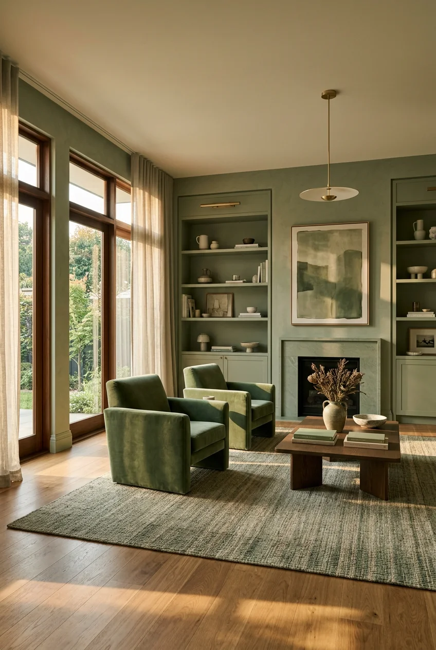
This trend involves painting every single surface in a room the exact same color. I’m talking about the walls, the ceiling, the trim, the baseboards, and even the doors. It creates a cohesive, atmospheric hug of color. For a sophisticated feel, I’d highly recommend deep sage greens. Farrow & Ball Calke Green is stunning, though it costs about $130 per gallon. You can also try Benjamin Moore Salamander or Sherwin Williams Dried Thyme. I tried this in my tiny half-bath last month. I taped off the mirror, bought a gallon of Dried Thyme for $75, and went to town. Honestly, it smelled like wet clay and intense paint fumes for three days straight. I also forgot to tape the floor properly and ruined a perfectly good white bath mat. But once it dried, wrapping the walls and ceiling in that deep green made the room feel like a cozy, moody cave. The technique actually makes a small room feel larger because your eye doesn’t stop at the trim. It just keeps moving upward.
2. Experiment with “Color Capping” for Subtle Impact

If painting your ceiling a dark green scares you, you aren’t alone. Color capping is a nuanced alternative to drenching. You use different strengths of the exact same color family across elements like the ceiling, trim, and doors, while the walls stay a separate but complementary shade. Ruth Mottershead, the Creative Director of Little Greene, explains that this adds massive depth without overwhelming the room. It allows for a braver use of color while still feeling safe. I recently did this in a client’s dining room. We used one gallon of Sherwin Williams Alabaster ($75) on the walls. Then, we painted the trim a slightly darker taupe, and the ceiling a very soft, pale beige. It took two extra quarts of paint at $24.99 each. The result is incredible. The room feels grounded. You don’t immediately notice the different shades, but you feel the warmth. Just make sure you use a high-quality angled brush for the trim. A cheap $3 brush will leave horrible streaks that catch the light and ruin the entire effect.
3. Shift to Warm Neutrals as Your Foundation

The cool grays of the past decade are completely out. They’re replaced by warm neutrals like soft mushroom, chalky taupe, creamy beige, and gentle putty tones. Dutch Boy’s 2026 Color of the Year, Melodious Ivory (313-2DB), is a soft, warm cream that works across all design styles. It costs around $35 per gallon and pairs beautifully with natural materials like raw wood and woven linen. I’ve made the gray mistake before. In 2019, I painted my entire hallway a stark, cool gray. I bought three gallons from Home Depot. It looked absolutely terrible. The space felt like a sterile dentist waiting room. The light bounced off the walls and made everyone look slightly sick. Skip the cool grays entirely. Warm neutrals create a calming backdrop that ages gracefully. When you use a creamy beige, your colorful art and textured pillows actually stand out instead of clashing with the icy walls. I usually buy two 8-ounce sample pots ($5.99 each) of warm neutrals to test them first. Learned that the hard way.

UTTCMK Bookshelf Decor Thinker Statue
A dependable everyday pick — UTTCMK Bookshelf Decor Thinker Statue – Abstract Art Reading Thinker S pulls in 809 ratings at 4.5 stars. Not flashy, just solid.
4. Master the 60-30-10 Rule for Balanced Palettes

Interior designers like Jennifer Burt swear by this classic rule. Sixty percent of the room features your main color, which is usually a neutral. Thirty percent is your secondary accent color. Ten percent incorporates small, punchy pops of a complementary color. This framework stops your room from looking like a one-dimensional catalog layout. I’ve used this exact formula in my own bedroom. My walls and large 8×10 wool rug make up the sixty percent in soft cream. My thirty percent comes from a large navy blue upholstered bed frame and heavy velvet curtains. The ten percent is where it gets fun. I bought a small, bright mustard yellow ceramic vase for $12.99 from Target and placed it on my nightstand. I also added a 12×20-inch mustard lumbar pillow to the bed. It provides just enough tension to keep the room interesting. If you ignore this rule, you risk a space that feels chaotic or incredibly boring. Stick to the math. It works every single time.
5. Thoughtfully Distribute Color Throughout the Room

A massive mistake I see constantly is clustering colors in one single area. People will buy a bright red sofa and leave the rest of the room completely bare. You have to distribute colors thoughtfully to guide the eye naturally around the space. If your walls feature a specific shade of blue, you need to echo it subtly somewhere else. I like to pull colors across the room using textiles and small objects. Last week, I bought a gorgeous 6-inch ceramic plant pot from Sprouts for $14.99. It had this beautiful terracotta glaze. Instead of putting it next to my terracotta-colored armchair, I placed it on a bookshelf on the exact opposite side of the room. I also added a 5×8 area rug from Costco ($199) that had tiny flecks of that same rusty orange woven into the fibers. This creates harmony. It prevents the room from feeling disjointed or heavy on one side. Balance is everything when you’re dealing with strong pigments. You might also like: 20 Cozy Wall Decor Ideas for Every Budget
6. Layer Throw Pillows (Colour Coordinated Home Decor Ideas)

This is one of my favorite colour coordinated home decor ideas because it’s so easy to fix. For a standard 3-seater sofa, a reliable formula is two 20×20-inch or 22×22-inch square pillows as anchors in the corners. Follow that with one to two smaller accent pillows layered in front, like a 12×20-inch lumbar pillow. If you have a deep, oversized couch, start with larger 24-inch or 26-inch pillows. Here is my biggest secret. Always buy pillow inserts one size larger than the cover. If you have a 20×20-inch cover, stuff a 22×22-inch insert inside it. I buy the feather-fill inserts from Walmart for about $18 each. It makes the pillow look incredibly plump and expensive. I used to buy the exact same size insert and cover. The pillows always looked sad, flat, and wrinkly. They felt like cheap motel pillows. Sizing up gives you that perfect, karate-chop fullness that interior designers love. It’s a tiny detail that completely changes how your couch looks and feels. You might also like: 15 Lovely Cozy Home Decor Ideas to Steal Right Now

Vanselia Ceramic Flower Vase Home Decor
Vanselia Ceramic Flower Vase Home Decor – Farmhouse Table Vases Rustic punches above its price — 764 buyers rated it 4.5 stars. I would buy it again.
7. Don’t Underestimate the Impact of Lighting on Color

Lighting significantly alters how colors appear in your home. A color that looks perfect under the bright fluorescent lights of a hardware store might look like literal garbage in your living room. Always test paint colors in your actual space. You need to observe them at different times of day and under your specific artificial light. I learned this the hard way three years ago. I painted my guest bedroom a shade called soft peach. I spent $110 on premium paint. Under my 40-watt warm incandescent bulbs at night, the walls looked like raw salmon. It was horrifying. I had to repaint the entire room two days later. Now, I refuse to buy a gallon without testing first. Go buy a $5.99 sample pot. Paint a 24×24-inch square on two different walls. Look at it at 8 AM when the sun hits it, and look at it at 9 PM with the lamps on. It’s the only way to know for sure. You might also like: 20 Cozy Aesthetic Cozy Home Decor That Make a Real Difference
8. Incorporate Earthy Reds and Clay-Inspired Shades

Grounding, sun-warmed colors like terracotta, rust, and clay are bringing an earthy balance to contemporary homes. These shades make a room feel incredibly warm and inviting. PPG/Glidden’s Warm Mahogany (PPG1060-7) is a rich red-brown that looks amazing in a dining room. Benjamin Moore’s 2026 Color of the Year, Silhouette (AF-655), is a deep, muted charcoal-plum with heavy brown undertones. It creates an intimate, enveloping atmosphere. I recently added a heavy rust-colored linen table runner to my dining table. I bought it at a local boutique for $45. The texture of the rough linen combined with the earthy red tone completely changed the vibe of the room. It feels grounded now. Be careful not to overdo these heavy colors, though. If you paint all four walls a dark rust and have dark brown furniture, your room will feel like a muddy cave. Balance these clay tones with plenty of creamy whites and natural sunlight.
9. Mix Unexpected Color Combinations for Personality

You have to break away from traditional, boring pairings. Consider combinations like navy blue and pink, olive green and mustard yellow, or terracotta and sky blue. Interior designer Simon Temprell suggests pairing a soft, mid-blue with a bright tangerine. You can also try teal and mustard by looking for complementary colors on opposite sides of the color wheel. I personally swear by olive green and blush pink. I bought a heavy, textured olive green throw blanket from Kroger last winter for $24.99. I tossed it over a chair that had a soft blush pink velvet cushion. The contrast is stunning. It feels fresh and slightly rebellious. Don’t be afraid to experiment with weird combinations. I once tried pairing neon green with dark purple, and it was a massive failure. It looked like a comic book villain’s lair. Stick to muted or jewel tones when mixing unexpected colors. It keeps the space looking mature and intentional rather than chaotic.

Farmhouse White Fake Decorative Books for Home Office Decor
Farmhouse White Fake Decorative Books for Home Office Decor – Religion has been one of the most consistently praised picks in this category. 10 reviewers averaged 4.5/5.
10. Leverage the Power of Blue for Calm

Blue is a massive dominant trend for 2026. Dulux named Free Groove, Mellow Flow, and Slow Swing as their hero indigo shades. These versatile blues offer stability, fluidity, and serious calming properties. They are ideal for creating serene spaces like bedrooms or home offices. Behr’s Hidden Gem (N430-6A) is a smoky jade blue-green that works perfectly as a new neutral. I painted an old, beaten-up wooden nightstand with one quart of a similar smoky blue. The paint cost me $19.98. I sanded it down, applied two coats, and added some $6 brass knobs. The cool, smooth finish of the blue paint against my warm oak floors is beautiful. Blue is incredibly forgiving. Just avoid bright, primary blues unless you’re decorating a child’s playroom. Stick to dusty, muted blues or deep, rich navies. They absorb light beautifully and make any room feel instantly more expensive and relaxed.
11. Create Monochromatic Schemes with Texture, Not Just Tone

Monochromatic rooms are huge right now, but you have to be careful. If you only use one flat color, your room will look completely dead. You must vary textures and materials within the same color family. Let’s say you want a blue room. Combine a deep navy velvet sofa with powder blue silk curtains and steel blue metallic accents. This layering adds massive depth and visual interest without introducing new colors. I have a monochromatic corner in my living room dedicated entirely to forest green. I have a matte green painted wall, a glossy green ceramic lamp ($35 from Target), and a soft, chunky knit green throw pillow. The contrast between the shiny ceramic, the flat wall, and the nubby yarn is what makes it work. If everything was matte, it would look like a green screen. Texture is your secret weapon. Always mix shiny, matte, rough, and smooth surfaces when sticking to a single color palette.
12. Budget Smartly for Accent Walls

Painting an accent wall is a cheap way to inject color, but you need to know the costs. If you hire a professional, an accent wall can range from $250 to $400 if it’s part of a larger project. If it’s a standalone job, expect to pay $400 to $750. DIY costs are much lower. You’re primarily paying for paint, which typically runs $15 to $35 per gallon for standard latex paint. One gallon covers about 300 to 400 square feet, which is more than enough for a single wall. I always DIY my accent walls. Last summer, I bought a gallon of deep charcoal paint for $32. I laid down a cheap plastic tarp, but I accidentally kicked my paint tray. I spilled dark gray paint all over the edge of a $199 wool rug from Costco. I scrubbed it for an hour, but there’s still a faint gray stain. Learn from my mistake. Buy heavy-duty canvas drop cloths. They cost $15 and will save your floors and your sanity.

GODONLIF Candle Warmer Lamp with Timer Dimmable
If you want something that just works, GODONLIF Candle Warmer Lamp with Timer Dimmable is a safe bet (77 reviews, 4.5 stars).
13. Don’t Be Afraid of Darker, Moodier Palettes

Designers are fully embracing richer shades like mahogany and chocolate. They often pair these dark colors with textured walls, wood paneling, or heavily patterned wallpapers. Benjamin Moore’s Silhouette (AF-655) is a deep espresso brown that was chosen as their 2026 Color of the Year. It’s absolutely perfect for creating a luxurious, old-money feel in a study, dining room, or library. I painted my tiny home office a dark chocolate brown last fall. Everyone told me it would make the room feel like a closet. They were wrong. The dark walls made the edges of the room blur, making it feel cozy and infinite. I added shiny brass cabinet pulls ($12.50 each) to my desk drawers to bounce some light around. The combination of the dark, matte brown walls and the bright, heavy brass is stunning. Don’t let people scare you away from dark paint. Just make sure you have decent ambient lighting, like a warm desk lamp or a good floor lamp.
14. Incorporate Pistachio Green and Amber for Freshness

Pistachio green is a recurring spring and summer trend that visually calms a space. It’s incredibly easy to apply to walls or cabinets. Amber tones are also making a huge comeback in 2026. Amber behaves more like a material than a plain paint color. It pairs beautifully with raw wood, rough stone, natural linen, and aged metal. I’m completely obsessed with amber glass right now. I bought a gorgeous, heavy amber glass vase from the Whole Foods floral section for $16.99. I loved it so much that I bought a second one. Unfortunately, I dropped the second one on my tile floor while unpacking groceries, and it shattered into a million sharp, sticky pieces. But the one that survived looks amazing sitting on my kitchen island. When the afternoon sun hits the amber glass, it casts a warm, golden glow across the white marble counters. It’s a tiny, inexpensive detail that brings so much warmth to a cool-toned kitchen.
15. Avoid Being “Too Matchy-Matchy” (Colour Coordinated Home Decor Ideas)

While coordination is obviously the goal, being overly matchy is a massive mistake. It leads to a flat, one-dimensional space that looks like a cheap furniture showroom. Instead of perfectly matching every single item, you should aim for cohesion by repeating colors with slight variance. If you have a primary blue scheme, use different shades like teal, navy, and sky blue together. I used to buy matching bedroom sets. I had the matching cherry wood bed, the matching nightstands, and the matching dresser. It was visually exhausting and incredibly boring. I finally sold the nightstands on Facebook Marketplace and replaced them with mismatched vintage brass tables. The room instantly felt curated and collected rather than bought out of a catalog. You want your home to look like it evolved over time. Mix your shades, mix your wood tones, and definitely mix your metals. It creates a much more dynamic and visually appealing environment.

Lvases Snuggle Hollow Ceramic Vase Set of 2
Lvases Snuggle Hollow Ceramic Vase Set of 2 punches above its price — 18 buyers rated it 4.5 stars. I would buy it again.
16. Use Natural Elements to Bridge Color Gaps

When you have two colors that just won’t play nicely together, natural elements are the perfect bridge. Raw wood, woven rattan, and live plants act as neutral palate cleansers for your eyes. If your bright blue sofa and your terracotta rug are fighting for attention, put a large green plant between them. I bought a stunning 10-inch Monstera plant from Trader Joe’s for $24.99. I placed it in a woven seagrass basket in the corner of my living room. The vibrant, organic green of the leaves instantly softened the harsh contrast between my furniture pieces. Plants bring life and texture to a room, and they literally go with every single color palette on earth. Just don’t overwater them. I drowned a beautiful Fiddle Leaf Fig last year because I gave it three cups of water every single day. The leaves turned brown and fell off, completely ruining my aesthetic. Stick to watering once a week, and let the green leaves do the heavy lifting for your decor.
17. Anchor the Space with a Statement Rug

A large area rug is the absolute best starting point for a color-coordinated room. It’s much easier to pull paint colors and pillow fabrics from a rug than it’s to find a rug that perfectly matches your existing walls. I always tell people to buy the rug first. Find a pattern or a mix of colors that you absolutely love. I bought an 8×10 vintage-inspired wool rug for $350 online. It has deep reds, faded navies, and soft creams woven into it. I used that exact rug as the blueprint for my entire living room. I matched my curtains to the soft cream, my sofa to the navy, and my throw pillows to the deep red. It takes all the guesswork out of decorating. If you build your room from the floor up, the color palette will naturally feel cohesive. Just make sure the rug is large enough. A tiny 5×7 rug floating in the middle of a large living room looks ridiculous and makes the space feel smaller. No exaggeration.
Getting your colors right takes a little bit of patience and a lot of trial and error. I’ve painted rooms the wrong color, bought the wrong sized pillows, and shattered my fair share of vases. But when you finally nail that perfect balance of warm neutrals, deep accents, and rich textures, it changes how you feel in your home. I’d highly recommend starting small. Grab a $5.99 paint sample or a new textured throw pillow before you commit to painting your entire house dark brown. Take it one room at a time. If you found these tips helpful, make sure you pin this article to your home decor Pinterest board so you can find it next time you’re standing in the paint aisle feeling overwhelmed.
Frequently Asked Questions
How do I start color coordinating my home?
Start by finding an anchor piece, like a large 8×10 area rug or a piece of artwork you love. Pull three colors from that piece to create your palette: a dominant neutral, a secondary color, and a bold accent for small accessories.
What is the 60-30-10 rule in interior design?
The 60-30-10 rule is a classic formula for balancing color. Sixty percent of the room is your main neutral color, thirty percent is your secondary accent color (like furniture), and ten percent is a bold pop of color used for small decor items.
Can I use dark colors in a small room?
Yes. Painting a small room a dark, moody color like deep espresso or forest green blurs the edges of the walls, making the space feel cozy and infinite. Just make sure you incorporate warm ambient lighting and metallic accents to bounce light around.
Why do my paint colors look different at home?
Lighting drastically changes how paint looks. The fluorescent lights in a hardware store are much cooler than the warm incandescent bulbs in your living room. Always buy a small sample pot and test the paint on your walls at different times of day.
