What’s Inside
- Embrace Warm Neutrals for an Inviting Base
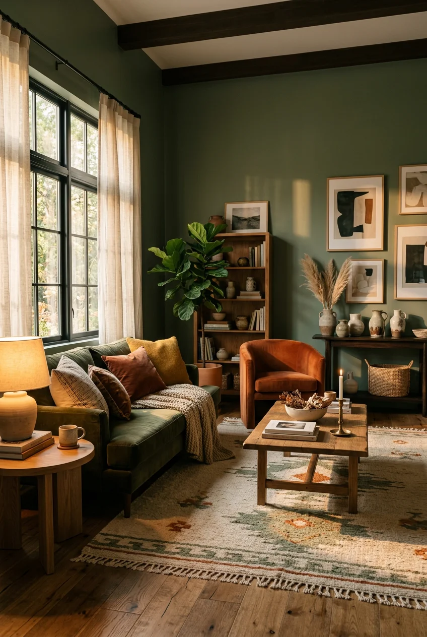
- Go Earthy with Muted Greens for Cozy Living Room Paint Colors
- Dive into Soft Terracotta and Clay Hues
- Experiment with Color Drenching
- Understand and Test Undertones
- Invest in Quality Paint Samples
- Don’t Fear Dark Colors in Small Spaces
- Opt for Warmer Whites Over Stark Ones
- Select the Right Sheen for Coziness
- Embrace Moody Accent Walls for Cozy Living Room Paint Colors
- Explore Rich Reds and Berry Tones
- Factor in Your Room’s Orientation
- Don’t Overlook the Ceiling
- Budget for Quality Paint
- Prep Your Walls Properly
- Balance with Lighting and Decor
Last October, I painted my north-facing den a stark, icy gray because an algorithm told me it was modern. Two days later, I was huddled under a $24.99 fleece throw from Target, shivering in a room that felt exactly like a dentist’s waiting area. The lighting bounced off the blue undertones and made my skin look vaguely sick. That expensive mistake forced me to research actual cozy living room paint colors that work in real houses, not just highly edited photos. If you’re staring at a wall of chips at the hardware store right now, feeling entirely paralyzed, I get it. I spent three months testing different formulas, sheens, and lighting scenarios so you don’t have to guess. I’ve ruined enough drywall to know what actually looks good when the sun goes down and your lamps click on. I learned that the hard way. Here are 16 specific, methodical ways to approach your walls this weekend, complete with the exact brands and formulas that won’t leave you shivering in a gray box.
1. Embrace Warm Neutrals for an Inviting Base

Skip the stark, cool grays entirely. They reflect blue light and make standard 8-foot ceilings feel oppressive. Instead, you’ll need a warm neutral base. Benjamin Moore’s Steam AF-15, which runs about $74.99 a gallon, is my standard recommendation for a baseline white that doesn’t feel clinical. I used this in a client’s 1990s build last Tuesday, and it immediately neutralized the harsh afternoon glare. If you want something with more depth, Sherwin-Williams’ Accessible Beige SW 7036 sits right on the edge of mushroom and cream. It costs $72.49 for a gallon of their Cashmere interior acrylic. I applied two coats over a dark blue wall last month. It took exactly 1.5 gallons to cover 300 square feet. This shade provides a flexible foundation for linen sofas and heavy wool rugs. The slight yellow undertone warms up beautifully under 3000K LED bulbs at night, which prevents that sterile, empty-box feeling when the sun goes down. I use a 3/8-inch nap roller for these flat walls to avoid unnecessary texture. The paint dries to the touch in about an hour, but I always wait four hours before doing the second coat.
2. Go Earthy with Muted Greens for Cozy Living Room Paint Colors

Earthy greens are a massive shift for 2026, bringing a calming, organic weight to standard drywall. Sherwin-Williams’ Evergreen Fog SW 9130 is a muted, gray-green that costs $72.49 per gallon. I brushed this onto my own living room walls in November. The color shifts drastically depending on the time of day. At noon, it reads like dried eucalyptus. By 8 PM, it’s a deep, shadowy forest tone. Benjamin Moore’s Saybrook Sage HC-114 is another excellent option if you want slightly more silver in the mix. When testing these cozy living room paint colors, you’ve got to look at them next to your actual furniture. I made the mistake of picking a green that clashed violently with my orange-toned oak floors. To fix it, I had to buy a massive 9×12 jute rug from Walmart for $149 just to create a visual buffer between the wood and the wall. Pick your green based on your fixed elements, not just because the chip looks pretty in the store.
3. Dive into Soft Terracotta and Clay Hues

If you want genuine warmth without painting your room fire-engine red, soft terracotta is the exact middle ground. Behr’s Burnished Clay is a dusty, muted option that costs $45.98 a gallon. It has a chalky, baked-earth quality that absorbs light rather than bouncing it around. I used this in a small, windowless media room, and it immediately stopped feeling like a storage closet. Sherwin-Williams’ Cavern Clay SW 7701 is a deeper, more saturated version. I recommend using a high-density woven roller for these clay colors to get a smooth, even finish. The trick with terracotta is avoiding anything with too much orange. You want a heavy brown base. I tested a cheaper brand’s terracotta once, and it dried looking exactly like crushed cheese snacks. I had to roll two coats of primer over it the next morning. Stick to the muted, dusty versions to keep the room grounded, quiet, and sophisticated.
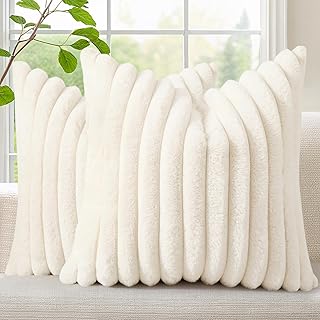
decorUhome Summer Cozy Faux Fur Throw Pillow Covers 18×18
Honestly, decorUhome Summer Cozy Faux Fur Throw Pillow Covers 18×18 Set of 2 Dec surprised me — sturdier than it looks in the photos, and over 3 buyers gave it 4.5 stars.
4. Experiment with Color Drenching

Color drenching means painting your walls, baseboards, crown molding, and doors the exact same color. It erases the visual boundaries of the room, creating a cocoon effect. For a deeply cozy feel, I use Farrow & Ball’s Green Smoke No. 47. Yes, it’s $140 a gallon, which hurts the wallet, but the pigment density is impossible to replicate with cheaper brands. The ultra-matte finish looks exactly like velvet. If you’re on a stricter budget, Benjamin Moore’s Hearthstone Brown 2109-20 gives a similar enveloped feeling for $75 a gallon. When I first tried color drenching, I used a semi-gloss on the trim and an eggshell on the walls. It looked messy. It completely ruined the continuous visual line. You’ll need to use the exact same sheen—preferably matte or eggshell—on every single surface. I buy heavy-duty canvas drop cloths at Costco (the 2-pack for $24.99) because rolling ceilings and doors simultaneously guarantees you’ll splatter your floors.
5. Understand and Test Undertones

A common mistake is completely ignoring a paint color’s undertones until it’s drying on your wall. Warm colors typically have red, orange, or yellow undertones. They’re what actually make a room feel cozy. You can’t see an undertone on a 2-inch paper chip under the buzzing fluorescent lights of a hardware store. You have to test large swatches. I paint 8×8 inch squares of my top three choices on multiple walls. Last spring, I picked a seemingly neutral beige for a client. We didn’t test it. By 4 PM, the room looked aggressively pink because the red undertones reacted with the setting sun. I had to buy two extra gallons of primer and start over entirely. Always look at your swatches in the morning, at noon, and at night with your lamps turned on. The artificial light from your lamps will pull entirely different tones than natural sunlight. Trust me on this. You might also like: 15 Farmhouse Decor Living Room You Need to See
6. Invest in Quality Paint Samples

Don’t rely on small paint chips. You need actual, liquid paint samples. Most brands sell quart sizes for around $9.99. I buy three or four quarts and paint large patches directly onto the drywall. I usually do this on a Saturday morning, then run to Whole Foods for a $4.99 iced Americano and some groceries while I wait for the first coat to dry. By the time I get back, I can see the true color starting to develop. You’ll need two coats for an accurate read. The paper chips are dyed with ink, not paint, so they don’t reflect light the same way the actual acrylic formula will. I’ve saved hundreds of dollars by spending $40 on samples first. The texture of your wall also changes the color. Heavily textured walls create tiny shadows that make the paint look darker than the sample card. Paint the actual wall, let it dry for 24 hours, and then make your decision. You might also like: 16 Home Decor Ideas Bedroom for Every Budget

Heart Pillow, Soft Heart Shaped Pillow with Room Decorative
Honestly, Heart Pillow surprised me — sturdier than it looks in the photos, and over 682 buyers gave it 4.5 stars.
7. Don’t Fear Dark Colors in Small Spaces

There is a persistent myth that small rooms require light colors to feel larger. In reality, painting a tiny room white just makes it look like a small, sad box. Deep, rich hues blur the corners of the room, making it feel more intimate and sophisticated. Benjamin Moore’s Sparrow AF-720 is a dark gray-brown that costs $74.99 a gallon. It absorbs shadows perfectly. Sherwin-Williams’ Charcoal Blue is another excellent choice for a snug atmosphere. I painted my 10×12 foot office Charcoal Blue last winter. At first, applying that first dark stripe of paint was terrifying. It looked black on the roller. But once the entire room was covered and the 2700K warm bulbs were turned on, the walls receded. If you’re using dark paint, you’ll need to upgrade your lighting. I added three brass table lamps with 40-watt equivalent bulbs to eliminate harsh overhead shadows. You might also like: 15 Clever DIY Cozy Home Decor That Make a Real Difference
8. Opt for Warmer Whites Over Stark Ones

If you absolutely must have white walls, ditch the brilliant, stark whites immediately. They belong in hospitals, not living rooms. You want a warmer white that provides softness. Sherwin-Williams’ Alabaster SW 7008 is a reliable choice. It has a subtle beige undertone that prevents it from feeling cold. It costs $72.49 a gallon. Benjamin Moore’s Steam AF-15 is another solid option. These shades let your furniture stand out without making the room feel clinical. I used a stark, untinted white base in my hallway once because I was too lazy to go back to the paint counter. It looked like a cheap apartment rental. I ended up repainting it Alabaster two weeks later. Warm whites are especially important if you have cool-toned LED lighting. The warmth in the paint counteracts the blue light from the bulbs, keeping the space grounded.
9. Select the Right Sheen for Coziness

The finish of your paint matters just as much as the color. For a truly cozy feel, you need a matte or eggshell finish. Matte paint absorbs light, creating a velvety, low-reflective surface that hides drywall imperfections. It gives a sophisticated, gallery-like vibe. Eggshell provides a tiny bit of durability with a subtle sheen, making it easier to wipe off fingerprints. I strictly avoid satin or semi-gloss on living room walls. The glare from lamps and windows bouncing off a shiny wall instantly kills any cozy atmosphere. I learned this the hard way when I bought a mis-tinted gallon of satin beige for $15. The color was fine, but the shiny finish highlighted every single nail pop and dent in my 1950s plaster walls. If you have kids or pets, stick to a high-quality eggshell like Benjamin Moore’s Regal Select ($75.99/gallon) so you can actually scrub it without removing the pigment.

KHOYIME Large Macrame Wall Hanging Boho Woven Tapestry
Honestly, KHOYIME Large Macrame Wall Hanging Boho Woven Tapestry surprised me — sturdier than it looks in the photos, and over 994 buyers gave it 4.5 stars.
10. Embrace Moody Accent Walls for Cozy Living Room Paint Colors

If color drenching an entire room feels too aggressive, a moody accent wall is a solid compromise. Deep navy, forest green, or charcoal are standard choices that anchor a space. Benjamin Moore’s Hale Navy HC-154 is a classic for a reason. It has enough gray in it to keep it from looking like a primary blue crayon. Sherwin-Williams’ Naval SW 6244 is slightly more saturated. I painted the wall behind my TV Naval last year. It cost $72.49 for the gallon, and I only needed half of it. The dark background makes the black TV screen blend in when it’s turned off, which instantly reduces visual clutter. When looking at cozy living room paint colors for accent walls, make sure to tie the color into the rest of the room with textiles. I bought a $29.99 navy blue throw pillow from Target to put on the opposite sofa so the dark wall didn’t feel completely disconnected from the space.
11. Explore Rich Reds and Berry Tones

Burgundy, rich reds, and berry tones are difficult to get right, but when you do, they bring incredible intimacy to a space. Farrow & Ball’s Dead Salmon No. 28 is a muted, muddy pink with vintage warmth. It doesn’t look like salmon at all. It reads like aged plaster. Benjamin Moore’s Pomegranate is a sophisticated pink-red that works well in dimly lit rooms. I tried a bright cherry red in my dining room in 2018. It was a disaster. It made everyone look flushed and angry under the chandelier. You’ve got to choose muted, muddy versions of red. The brown undertones are what make it cozy instead of alarming. I highly recommend using a tinted gray primer under any red or berry paint. Red pigment is notoriously sheer. Without a $25 gallon of gray primer underneath, you’ll be rolling five coats of expensive paint just to get solid coverage.
12. Factor in Your Room’s Orientation

The direction your windows face dictates how your paint will actually look. North-facing rooms get cool, blue-tinted light all day. If you put a cool gray in a north-facing room, it’ll look like a freezer. You need colors with yellow or pink undertones to counteract the chill. Paint & Paper Library’s Cashmere is a great example of a warm tone that fights northern light. South-facing rooms get warm, golden light. They can handle cooler tones, like a blue-gray, without losing that cozy feeling. I ignored room orientation in my first house. I painted a south-facing living room a warm, buttery yellow. By 2 PM, the afternoon sun hit the walls and the room practically glowed neon yellow. I had to keep the blinds closed just to sit in there. Always check your compass app on your phone before you commit to a specific temperature of paint.

QUBA LINEN 18 x 18 Throw Pillow Insert – Pack of 2 White
A dependable everyday pick — QUBA LINEN 18 x 18 Throw Pillow Insert – Pack of 2 White pulls in 29 ratings at 4.5 stars. Not flashy, just solid.
13. Don’t Overlook the Ceiling

Automatically painting your ceiling flat white is a missed opportunity. A stark white ceiling draws the eye up and creates a harsh boundary line at the top of your walls. To make a room feel enveloping, you need to address the fifth wall. I usually ask the paint counter to mix a batch of my wall color at 50% strength. This gives you a slightly lighter shade of your wall color for the ceiling. It costs the same as a standard gallon, usually around $75. It blurs the lines of the room. I tried painting a ceiling the exact same dark green as the walls once. While it looked incredibly dramatic, it made the 8-foot ceiling feel about 6 feet tall. Lightening the formula by half keeps the cozy, cohesive look without making you feel like you’re standing in a cave. I always buy a $12 extension pole for my roller to save my shoulders during ceiling work.
14. Budget for Quality Paint

Cheap paint is a false economy. You might save $30 at the register, but you’ll spend an extra four hours rolling a third coat because the coverage is terrible. Expect to pay between $50 and $80 per gallon for high-quality interior paint from Sherwin-Williams or Benjamin Moore. The higher price tag means more titanium dioxide in the formula, which is the ingredient that actually hides the old color underneath. I bought a $25 gallon of generic brand paint from a hardware store three years ago to save money on a flip project. It had the consistency of skim milk. It dripped everywhere, and I had to apply four coats to cover a light beige wall. I ended up spending more money on the extra gallons than if I’d just bought the $75 premium line to begin with. Invest in the good stuff. Your time is worth the extra cost.
15. Prep Your Walls Properly

No paint color will look cozy if your walls are covered in dents, nail holes, and old drips. You have to prep. I use a $6.98 tub of DAP DryDex spackling compound to fill every single hole. It goes on pink and dries white, so you know exactly when it’s safe to sand. I spend at least two hours sanding the walls with a 120-grit sanding sponge before I even open a can of paint. Last month, I skipped sanding the baseboards because I was tired. The new paint started peeling off in rubbery strips three days later because it couldn’t grip the old glossy surface. I had to scrape it all off and start over. After sanding, I wipe the walls down with a damp microfiber cloth. I usually grab a 12-pack of microfiber cloths from Kroger for $9.99 in the automotive aisle. They trap the fine drywall dust perfectly.

Jexine 4 Pcs Hanging Planters with Artificial Eucalyptus
A dependable everyday pick — Jexine 4 Pcs Hanging Planters with Artificial Eucalyptus Metal Hanging pulls in 12 ratings at 4.5 stars. Not flashy, just solid.
16. Balance with Lighting and Decor

Your paint color is only one piece of the puzzle. The way you light the room determines how the paint behaves. Overhead recessed lighting flattens paint and casts harsh shadows. You need layered lighting. I use 2700K LED bulbs in all my table and floor lamps. This specific color temperature mimics the warm glow of an incandescent bulb. I buy the 4-packs of Philips LED bulbs at Sprouts for $14.99 when I’m picking up groceries. To test how a paint color truly feels, I bring in fresh elements. I’ll grab a $5.99 bouquet of eucalyptus from Trader Joe’s and set it against the painted swatch. The organic, piney smell of the leaves against the matte paint gives me a much better sense of the room’s final vibe than staring at an empty wall. No exaggeration. Paint needs context. Add your lamps, your rugs, and your plants before you judge the final color.
Finding the right shade takes patience, a lot of swatching, and a willingness to live with a patchwork wall for a few days. Don’t rush the process. Let the paint dry, watch the light change, and trust your gut when a color feels right. I’m currently testing out three different clay tones for my hallway, and it’s a mess, but it’s worth it. Pin this guide for your next hardware store run so you don’t end up with another icy gray mistake.
Frequently Asked Questions
What are the best cozy living room paint colors for small spaces?
Darker shades like charcoal blue or deep brown actually blur the edges of a small room, making it feel intimate rather than cramped. Just ensure you layer your lighting properly with warm 2700K bulbs.
Should I use matte or eggshell paint in a living room?
Matte provides a velvety finish that hides drywall imperfections and absorbs light for a cozy feel. Eggshell offers a slight sheen and better durability if you need to wipe down the walls frequently.
How do I test paint undertones correctly?
Paint 8×8 inch swatches directly on multiple walls. Check them in the morning sunlight, afternoon shade, and at night with your artificial lamps turned on to see how the undertones react to different lighting.
Does room orientation affect paint color?
Yes. North-facing rooms pull cool, blue light, requiring warm-toned paints to counteract the chill. South-facing rooms receive warm, golden light and can handle cooler paint colors without feeling cold.
