What’s Inside
- Try Hue Drenching for Your Brown Living Room Decor
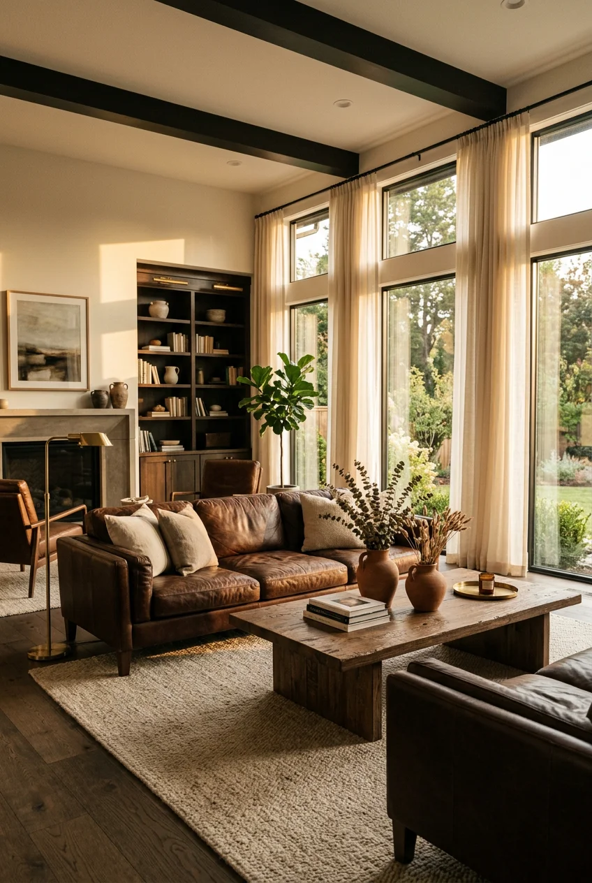
- Anchor the Space with a Brown Leather Sofa
- Size Your Area Rug Properly
- Layer Washable Complementary Rug Colors
- Mix Jute and Wool Textures
- Soften the Room with Velvet Cushions
- Add Brass Floor Lamps for Contrast
- Warm LED Lighting is Crucial
- Balance Dark Furniture with Greige Walls
- Hang a Measured Earth-Toned Gallery Wall
- Fill Empty Corners with Large Greenery
- Identify Your Specific Brown Undertones
- Pull Furniture 5 Inches Off the Wall
- Intentionally Mix Light Oak and Walnut
- Apply a Light Brown Limewash Accent
- Install Woven Bamboo Window Shades
- Ground the Brown Living Room Decor with Scent
I painted my living room a flat chocolate brown back in 2018. It looked exactly like the inside of a damp cardboard box. Mastering brown living room decor takes more than just slapping a dark paint color on the walls and calling it a finished project. I spent three entire weeks trying to figure out why my space felt so heavy and depressing before realizing I had zero texture to break up the visual weight. Brown is tricky. It absorbs light quickly. If you don’t balance it with the right lighting, textiles, and wood tones, the room feels like a cave. I learned that the hard way after wasting two weekends and three gallons of paint. Let’s fix those common mistakes.
1. Try Hue Drenching for Your Brown Living Room Decor

Instead of painting just one accent wall, try hue drenching. This means layering various shades from light taupe to deep chocolate across your walls, trim, and ceiling. It creates depth without making the room feel flat. I tried this last October in my own den. I used Benjamin Moore Hearthstone Brown ($69.99 for a gallon) on the walls and a slightly lighter taupe for the baseboards. You’re building a monochromatic look that feels intentional. A major mistake I made initially was using a flat finish for everything. Flat paint in dark brown shows every single fingerprint and scuff mark. I switched to an eggshell finish for the walls and semi-gloss for the trim. It reflects just enough light to keep the room from feeling dead. Sherwin-Williams Urbane Bronze is another excellent deep gray-brown option. Just make sure you buy a $4.99 sample pot first. Paint looks drastically different under your specific living room windows than it does under the harsh fluorescent lights at the hardware store.
2. Anchor the Space with a Brown Leather Sofa

A high-quality brown leather sofa grounds the entire room. I bought the Article Sven Charme Tan Sofa for $1,899 two years ago. It measures 88 inches long, which fits perfectly under my double windows. Full-aniline leather is the best choice because it develops a natural patina over time. You’ve got to accept that it’ll scratch. My golden retriever jumped on the seat cushions on day two and left a massive scratch down the middle. I was furious at first. Now, I just rub a little bit of Otter Wax Leather Salve ($19.95 for a 2 oz tin) into the marks every three months. The scratches blend in and make the piece look lived-in. No exaggeration. Skip bonded leather entirely. It peels after 18 months of daily use and leaves little brown flakes all over your floor. Spending the extra money on solid wood frames and real leather means you won’t be replacing your primary seating again in three years.
3. Size Your Area Rug Properly

Most people buy rugs that are way too small. A tiny 5×7 foot rug floating in the middle of your floor makes the room look disconnected. For a standard 72 to 84-inch sofa, you need an 8×10 foot rug minimum. If you’ve got a large sectional, you’re looking at a 9×12 foot or even a 10×14 foot rug. The rule is simple. The rug needs to extend at least 6 to 12 inches beyond each end of your sofa. At least the front legs of all your chairs and couches should rest on top of it. I bought a Target Threshold 8×10 foot woven rug for $140 last spring. It looked great for a week until the edges started curling up. I tripped over it twice holding a cup of coffee. You’ve got to buy a thick felt rug pad ($45 on Amazon) to put underneath. It adds 1/4 inch of cushioning and stops the corners from rolling up.
Vanselia Ceramic Flower Vase Home Decor
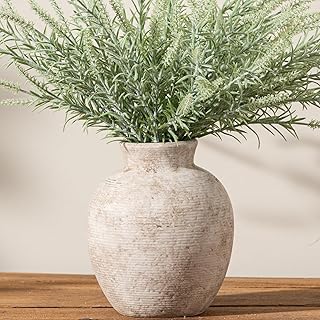
Vanselia Ceramic Flower Vase Home Decor – Farmhouse Table Vases Rustic has been one of the most consistently praised picks in this category. 786 reviewers averaged 4.5/5.
4. Layer Washable Complementary Rug Colors

For a cohesive look, opt for neutral rugs in beige, cream, or warm gray. For contrast, consider light blue, navy blue, or green. Yellows like mustard and oranges like rust create warmth and energy against dark furniture. I use the Ruggable Kamran Hazel 8×10 foot rug ($219) in my main living space. The taupe and tan pattern hides dirt incredibly well. Washability is crucial if you’ve got pets or kids. However, washing a heavy rug cover in a standard washing machine is an absolute nightmare. My machine sounded like it was going to explode during the spin cycle. I learned to take it to the laundromat and use their oversized commercial washers for $4.25. It gets much cleaner and doesn’t destroy your home appliances. Always dry it on the lowest heat setting possible. High heat melts the synthetic fibers and makes the edges ripple permanently.
5. Mix Jute and Wool Textures

You’ve got to prevent a brown room from feeling flat by layering distinct textures. Natural wood furniture, like a walnut coffee table, adds depth. I pair this with a chunky jute rug and heavy wool blankets. I bought a Better Homes and Gardens 8×10 foot jute rug from Walmart for $98. It brings a rough, earthy element that contrasts perfectly with smooth leather. The downside is that cheap jute sheds excessively. I had to vacuum daily for the first month to pick up all the loose fibers. To soften the seating area, I drape a 50×60 inch chunky wool throw blanket from West Elm ($79) over the back of the sofa. The mix of rough jute on the floor and soft wool on the couch keeps the eye moving. If everything in the room is smooth and flat, the brown color palette quickly becomes monotonous and boring.
6. Soften the Room with Velvet Cushions

Velvet provides a tactile richness that harmonizes beautifully with brown tones. I incorporate velvet throw pillows in shades like deep emerald green or rich burgundy for a touch of contrast. I use the 20×20 inch lush velvet pillow covers from CB2 ($49 each). The fabric catches the light and adds dimension to dark brown seating. A common mistake is using the exact same size insert as the cover. Your pillows will look sad and deflated. I always buy 22×22 inch down-alternative inserts ($24 at Pottery Barn) for my 20-inch covers. It fills out the corners perfectly. I tried washing the velvet covers in my sink once with regular laundry detergent. The fabric dried stiff and lost all its softness. You’ve got to use a gentle silk wash like The Laundress ($30 for 16 oz) and lay them completely flat to dry on a clean towel. Don’t ever put velvet in the dryer.

Vanselia Ceramic Vase Home Table Decor
If you want something that just works, Vanselia Ceramic Vase Home Table Decor – Flower Vases Set of 3 Small L is a safe bet (406 reviews, 4.5 stars).
7. Add Brass Floor Lamps for Contrast

Metallics like brass, gold, or polished silver bounce light around the room and prevent brown furniture from feeling too heavy. I use a West Elm Mid-Century brass floor lamp ($299) next to my reading chair. It stands 58 inches tall and adds a sophisticated gleam to a dark corner. The brass finish warms up the space much better than brushed nickel or matte black would. I made a mistake buying a cheap knockoff lamp from a discount site three years ago. The base was too light, and it tipped over constantly when I walked past it. The West Elm version has a heavy 12-pound marble base, so it stays put. The only annoying part is the power cord. It’s only 6 feet long, which means I had to buy a brown extension cord ($9 at Home Depot) to reach the nearest wall outlet without it looking ugly against the wood floors.
8. Warm LED Lighting is Crucial

Poor lighting makes brown spaces appear incredibly dull and dingy. You need layered lighting with warm LED bulbs to create a balanced atmosphere. I strictly use Costco Feit Electric LED bulbs ($14.99 for a 6-pack) in the 2700K to 3000K color temperature range. They put out 800 lumens, which is bright enough for reading but warm enough to feel cozy. I accidentally bought 4000K daylight bulbs once. I screwed them into my ceiling fixture, and my living room instantly looked like a sterile hospital cafeteria. The cool blue light clashed horribly with the warm brown walls. You need to combine overhead fixtures with task lighting and ambient table lamps. I put my main overhead lights on a Lutron dimmer switch ($29 at Lowe’s). Being able to drop the brightness by 50 percent in the evenings completely changes the mood of the room. It makes the brown tones feel rich instead of overwhelming.
9. Balance Dark Furniture with Greige Walls

If your main furniture pieces are dark brown, choose soft off-whites, balanced greiges, or muted taupes for your walls. This prevents the room from feeling too heavy and allows the brown furniture to stand out. I painted my living room walls with Benjamin Moore Revere Pewter ($69.99 for a gallon). It’s a perfect warm greige that bridges the gap between gray and beige. Painting over my old dark brown walls was a nightmare. I thought I could just use a paint-and-primer-in-one formula. The dark brown bled through immediately, leaving streaky shadows everywhere. I had to go back to the store, buy a gallon of Kilz 2 All-Purpose Primer ($24), and apply two thick coats before the Revere Pewter would cover properly. Don’t skip the primer if you’re trying to lighten up a dark room. It saves you money on expensive topcoat paint in the long run. You might also like: 20 Small Living Room Decor Ideas You Need to See

Vanselia Ceramic Flower Vase Home Decor
If you want something that just works, Vanselia Ceramic Flower Vase Home Decor – Farmhouse Table Vases Rustic is a safe bet (786 reviews, 4.5 stars).
10. Hang a Measured Earth-Toned Gallery Wall

A well-executed gallery wall adds personality to a large blank space. For a brown living room, an earth-toned gallery wall with a mix of browns, beiges, and warm neutrals feels intentional. The center of your overall arrangement should sit exactly at eye level, roughly 57 to 60 inches from the floor. I use the Target Room Essentials 11×14 inch frames ($15 each) in a natural wood finish. You need to maintain consistent spacing of 2 to 3 inches between every frame. I used to eyeball the spacing and hammer nails directly into the drywall. It looked sloppy and crooked. Now, I trace all my frames onto Kraft paper ($6 a roll), cut them out, and tape the paper templates to the wall first. I use a laser level ($45 at Home Depot) to make sure the top edges align perfectly. It takes an extra hour of prep work, but you won’t have random holes in your walls. You might also like: 16 Home Decor Ideas Bedroom for Every Budget
11. Fill Empty Corners with Large Greenery

Plants provide a vibrant contrast against brown backdrops. They align with the natural, grounded feel that earthy tones evoke. I use varying sizes, from large floor plants to smaller tabletop succulents. I bought a Fiddle Leaf Fig from Sprouts for $24.99 last spring. It came in a standard 10-inch plastic nursery pot. The bright green leaves pop beautifully against my dark leather sofa. Fiddle Leaf Figs are incredibly dramatic, though. I moved mine three feet away from the window, and it dropped four leaves in protest. They need bright, indirect sunlight from a south-facing window. I repotted it into a 12-inch terracotta planter from The Home Depot ($19). Terracotta is porous, which helps the soil dry out faster. If you leave these plants in plastic pots without drainage holes, the roots rot in a matter of weeks. I water mine with exactly 2 cups of filtered water every Sunday morning. You might also like: 20 Cozy DIY Farmhouse Decor Ideas That Are Totally Worth It
12. Identify Your Specific Brown Undertones

Treating brown as a generic neutral is a massive mistake. Every brown has a specific undertone. It’s usually red-based, yellow-based, or cool and muted. Ignoring these undertones leads to a visually confused space. I learned this when I tried to put a red-mahogany side table next to a yellow-toned oak TV stand. The clash was immediate and jarring. The mahogany looked purple, and the oak looked green. You’ve got to identify the undertone of your dominant brown pieces first. If you’ve got a warm, red-based brown sofa, you need to pair it with other warm hues like rust or terracotta. To figure out your undertones, grab a handful of Sherwin-Williams paint swatches ($3.99 for a pack). Hold a pure primary red, yellow, and blue swatch against your wood furniture in natural daylight. The dominant undertone will immediately pop out. Once I figured out my floors were yellow-based, I stopped buying cool-toned walnut pieces.

Jexine 4 Pcs Hanging Planters with Artificial Eucalyptus
Honestly, Jexine 4 Pcs Hanging Planters with Artificial Eucalyptus Metal Hanging surprised me — sturdier than it looks in the photos, and over 12 buyers gave it 4.5 stars.
13. Pull Furniture 5 Inches Off the Wall

Pushing all your furniture flat against the walls is a terrible habit. We all do it because we think it makes the room look bigger. It actually just makes the space feel completely disconnected, like a doctor’s waiting room. If your floor plan allows it, pull your sofa and chairs at least 5 to 10 centimeters away from the baseboards. I pull my main sofa a full 12 inches out and stick a slim console table behind it. This simple shift creates breathing room. You anchor the floating seating arrangement with a large rug, and suddenly you’ve got an intimate conversation area instead of a bowling alley. I tried the wall-hugging layout for months in my narrow living room. The acoustics were terrible. Every time someone spoke, the sound bounced right off the drywall. Pulling the furniture inward fixed the echo and made the room feel cozy. If you’re worried about cords showing, buy a $12 cord concealer kit from Walmart.
14. Intentionally Mix Light Oak and Walnut

Don’t buy matching furniture sets. A matching coffee table, side table, and TV stand make your living room look like a cheap showroom floor. You should mix different wood finishes, like light oak with dark walnut. This adds dimension and layering, preventing a monolithic look. I’ve got a light oak console table (48 inches wide) from Target ($180) sitting across from a dark walnut coffee table. The contrast is what makes the space feel curated and lived-in. When I first moved in, I bought a matching three-piece cherry wood set off Craigslist for $200. The room felt incredibly heavy and dated. I ended up selling the side tables and replacing them with black metal and glass stands. When you mix wood tones, just make sure they share the same finish. A high-gloss mahogany table looks weird next to a matte, unfinished oak shelf. Keep the sheen levels consistent, and the varied colors will work together.
15. Apply a Light Brown Limewash Accent

For a subtle yet impactful touch, a light brown limewash wall accent adds movement and softness. It gives you depth without the heaviness of a bold, solid paint color. The natural variation catches light beautifully, offering a relaxed feel. I used Portola Paints limewash in a soft taupe shade ($65 for a gallon) on my fireplace wall. Applying it is a messy, physical process. You’ve got to use a specific 5-inch block brush ($18 at Sherwin-Williams) and paint in a continuous cross-hatch pattern. I made the mistake of stopping halfway down the wall to eat lunch. When I came back, the wet edge had dried, and it left a permanent, obvious line right across the middle of the wall. I had to repaint the entire section. You can’t touch up limewash. It dries chalky and matte, so you’ve got to seal it with a matte primer if you ever want to paint over it with regular latex paint.

Vintage Vase Set of 3, Ceramic Vintage Flower Vases
A dependable everyday pick — Vintage Vase Set of 3 pulls in 306 ratings at 4.5 stars. Not flashy, just solid.
16. Install Woven Bamboo Window Shades

Adding texture to your vertical space is just as important as your rugs and pillows. Woven bamboo shades filter harsh sunlight while adding warmth to your windows. I installed the Home Decorators Collection bamboo shades from The Home Depot ($45 for a 34×72 inch blind) in my living room. The natural wood tones tie in perfectly with my leather sofa and oak floors. Installing them took some patience. The included drywall anchors were flimsy plastic. I stripped two screws trying to force them into the wall before giving up. I drove to the hardware store and bought heavy-duty metal toggle bolts ($6 for a pack of four). They hold the heavy wooden header rail securely. The pull cords on these natural shades get tangled easily if you pull them at an angle. You’ve got to pull straight down slowly. They don’t block out 100 percent of the light, so I layered cheap white linen curtains over them for privacy.
17. Ground the Brown Living Room Decor with Scent

Visuals aren’t the only thing that matters for brown living room decor. Scent plays a massive role in how a space feels. Brown naturally evokes warmth, earthiness, and comfort. You want your room to smell the way it looks. I buy the 8 oz amber and sandalwood glass candles from Whole Foods for $12.99. The scent profile matches the moody, grounded aesthetic of a brown room perfectly. It took me years to figure out that scent really matters. Skip the fruity or overly floral scents here. They clash with the visual weight of heavy leather and dark wood. I burned a cheap synthetic watermelon candle in my den once, and the sensory disconnect was incredibly weird. Stick to cedar, amber, tobacco, or vanilla notes. A major issue with jar candles is tunneling. If you don’t let the wax melt all the way to the edges on the first burn, it creates a deep pit in the center. I trim my wicks to exactly 1/4 inch before every single use to prevent black soot.
Decorating with brown doesn’t mean settling for a dark, dreary space. By layering textures, managing your lighting, and mixing wood tones, you create a room that feels sophisticated and incredibly cozy. I’ve spent years tweaking my own layout, and swapping out flat paint for limewash and adding brass accents made all the difference. Don’t be afraid to experiment with your undertones and pull that furniture off the walls. If you found these tips helpful, pin this article to your home decor board so you have all the exact measurements and paint colors handy for your next weekend project!
Frequently Asked Questions
What colors go best with brown living room decor?
Warm neutrals like beige, cream, and greige pair beautifully with brown. For a pop of contrast, incorporate navy blue, emerald green, or rust orange through velvet pillows, washable rugs, or textured throw blankets.
How do I brighten a dark brown living room?
Layer your lighting with 2700K warm LED bulbs, add brass or metallic accents to reflect light, and paint your walls a soft off-white or light taupe. Incorporating a light-colored rug also breaks up the visual weight.
Is brown furniture coming back in style for 2026?
Yes, brown is highly trending as a grounding, earthy neutral. Designers are shifting away from stark grays and embracing rich chocolate, caramel leather, and varied wood tones to create warm, inviting living spaces.
What color rug should I use with a brown sofa?
A cream, warm gray, or taupe rug provides excellent contrast against a dark brown sofa. If you prefer color, choose a vintage-inspired pattern featuring muted blues or greens to complement the earthy tones.
