What’s Inside
- Embrace the New Neutrals for 2026
- Master the Art of Layering Textures
- Use the 90/10 Rule for Black Accents in Neutral Living Room Decor
- Incorporate Warm Wood Tones
- Layer Your Lighting for Ambiance
- Choose the Right Rug Size
- Vary Shades Within Your Palette
- Add Fresh Greenery for an Organic Pop
- Incorporate Subtle Patterns Through Textiles
- Select Furniture with Negative Space for Neutral Living Room Decor
- Pay Attention to Paint Undertones
- Ensure Proper Pathways for Functionality
- Use Metal Finishes as Neutral Accents
- Paint Furniture the Same Color as Walls
- Find the Golden Ratio for Coffee Tables
- Ditch the Matching Furniture Sets
- Bring in Natural Stone Elements
- Keep Everyday Clutter Hidden
- Use Scent as the Invisible Decor Layer
I cried on my living room floor last Tuesday, surrounded by five different shades of wet paint samples. Nailing your neutral living room decor isn’t as easy as slapping some off-white on the walls and calling it a day. I learned that the hard way when my first apartment ended up looking like a sterile hospital waiting room. The walls were flat. The sofa was boring. The whole space smelled weirdly like cardboard and regret. I’m Olivia, and I’ve spent the last six years figuring out how to make neutral spaces feel incredibly cozy and alive. You’re probably here because you want a room that feels calming, not lifeless. I completely get it. It’s a tricky balance to strike. You want those soft, buttery tones, but you also need depth, texture, and a layout that actually works for real life. Let’s walk through nineteen specific ways to get that perfect balance. I’ll share the exact products I use, the measurements you need to memorize, and a few embarrassing mistakes I’ve made along the way so you don’t have to repeat them.
1. Embrace the New Neutrals for 2026

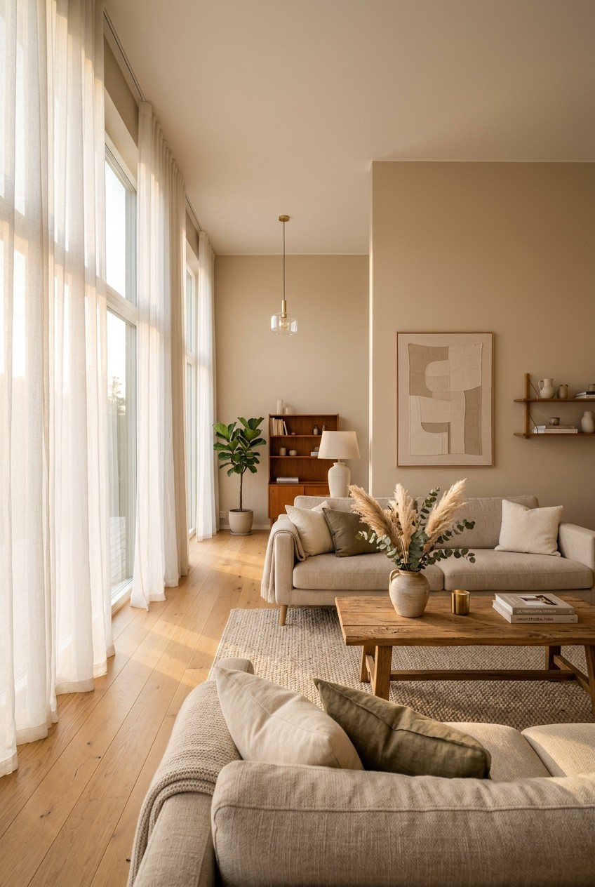
Classic beige and gray are fine, but I’m completely obsessed with the newer, earthier tones we’re seeing. I tried painting my walls a basic builder-grade gray two years ago, and it made the room feel like a cold concrete bunker. Don’t do that. Instead, look at paints like Sherwin-Williams Universal Khaki. It costs about $72.99 a gallon, and it’s this incredibly grounded mid-tone that instantly warms up a room. If you want something darker for an accent wall, Benjamin Moore’s Silhouette is a stunning espresso-charcoal blend. I also love using soft greens as a neutral base. Valspar’s Warm Eucalyptus gives you that calming, nature-rooted vibe without screaming that it’s a green room. You can grab a sample at Lowe’s for $5.98. These nuanced shades provide a much richer backdrop for your furniture than stark white ever could. They reflect the morning light beautifully and make your space feel intentionally designed rather than just blank.
2. Master the Art of Layering Textures

A massive mistake I see in neutral spaces is a total lack of dimension. If everything is smooth cotton and flat paint, your room will look incredibly cheap. You have to layer diverse textures to bring a neutral palette to life. I currently have the Mossley linen sofa from Soho Home. It’s an investment at $3,495, but the texture is unreal. I balance that crisp linen with a chunky, scratch-free knit wool throw I found at Target for $35.00. The contrast between the structured linen and the floppy, heavy wool is exactly what makes the space interesting. I also layered a rough jute rug under a softer 5×7 cotton rug. Bring in natural materials wherever you can. A boucle accent chair or a matte wood side table adds so much tactile interest. When you walk into the room, you should want to reach out and touch the fabrics. If your room feels boring, you aren’t lacking color. You’re lacking texture.
3. Use the 90/10 Rule for Black Accents in Neutral Living Room Decor

I used to be terrified of using black in my neutral living room decor. I thought it would ruin the soft, airy vibe I was going for. I was so wrong. A room without a tiny bit of dark contrast just floats away into a cloudy, undefined mess. You need a touch of black to ground the space. The trick is sticking to a strict ratio of 90 percent neutral tones and exactly 10 percent black. I incorporate this through really slim-profile furniture and small accessories. Last month, I picked up a set of three matte black picture frames from Walmart for $14.98. I hung them above a soft cream console table, and the contrast is stunning. You can also use a sculptural black metal coffee table or black iron curtain rods. It provides a crucial pop of contrast without making the room feel heavy or gothic. It’s like adding a pinch of salt to a batch of cookies (trust me on this).

Dog Sculpture Home Decor Cute Man and Dog Statue Decoration
Honestly, Dog Sculpture Home Decor Cute Man and Dog Statue Decoration for Office surprised me — sturdier than it looks in the photos, and over 326 buyers gave it 4.5 stars.
4. Incorporate Warm Wood Tones

Wood furniture is your best friend when you’re working with a neutral palette. It brings a natural richness and warmth that you can’t get from painted surfaces. My biggest piece of advice is to mix your wood tones. Please don’t buy a matching set where the coffee table, end tables, and TV stand are all the exact same shade of oak. It looks like a furniture showroom, not a home. I love pairing a light oak console from Castlery. Their pieces usually run around $699 and have gorgeous natural finishes. I contrast that with a much darker walnut side table. I found a great little walnut drink table at Target for $55.00. The tension between the light and dark woods creates visual interest. When I walk into my living room holding my morning coffee, the morning sun hits those mixed wood grains, and it just feels so incredibly cozy and inviting. Wood brings the outside in.
5. Layer Your Lighting for Ambiance

Let’s talk about the dreaded big light. I absolutely hate harsh overhead lighting. It makes even the most expensive neutral spaces feel like a sterile dentist’s office. You need to layer your lighting to create a warm, inviting ambiance. I rely entirely on dimmable warm LED bulbs. I buy the Great Value 4-pack of warm white LEDs from Walmart for $12.99. They cast the perfect buttery glow. Instead of the ceiling light, I use a combination of floor lamps, table lamps, and wall sconces. I have a brass reading lamp tucked next to my sofa, right above a textured Fleur Pillow from Room & Board that cost $89.00. When I turn that lamp on at night, the warm light highlights the texture of the pillow beautifully. Create little pools of light around the room rather than blasting the whole space with one bright bulb. It completely changes the mood of the room after the sun goes down.
6. Choose the Right Rug Size

Most people get this wrong, and it drives me crazy. Buying a rug that is too small will instantly ruin your space. It makes the room look disjointed and cheap. I made this mistake in my twenties, buying a tiny 5×7 rug for a massive living room just to save money. It looked like a postage stamp floating in the middle of the floor. For a cohesive look, at least the front legs of all your key seating pieces must rest on the rug. If you have a large living room, leave about 24 inches of bare floor between the wall and the rug. In smaller rooms, 10 to 18 inches of negative space is perfect. I highly recommend the Teagan Collection from Loloi Rugs. Their ivory and sand 8×10 rug is usually around $249.00 on Amazon. It has gorgeous, subtle tones that tie a neutral room together perfectly without fighting for attention. You might also like: 20 Brilliant Cozy Living Room Home Decor Ideas That Are Totally Worth It

UTTCMK Bookshelf Decor Thinker Statue
If you want something that just works, UTTCMK Bookshelf Decor Thinker Statue – Abstract Art Reading Thinker S is a safe bet (771 reviews, 4.5 stars).
7. Vary Shades Within Your Palette

If you only use one shade of beige for everything, your room will look incredibly flat. I call this the oatmeal explosion. I once helped a friend who had beige walls, a beige sofa, and a beige rug. It was genuinely disorienting to walk into. To prevent a monochromatic disaster, you have to use different shades and tints of your chosen neutrals. If your dominant color is a warm, sandy beige, introduce creamy off-white walls and a soft taupe sofa. I like to lay out all my fabric swatches on my kitchen counter before buying anything. I’ll grab a stark white piece of printer paper to compare the undertones. You want a gradient of color, from light cream to deep mushroom. This layering of similar hues creates depth and sophistication. It makes the room feel layered and collected over time, rather than bought all at once from a single catalog page. You might also like: 20 Creative Cozy Farmhouse Decor Ideas That Actually Work
8. Add Fresh Greenery for an Organic Pop

You absolutely need living plants in a neutral room. It’s not optional. The organic shapes and vibrant green leaves provide a beautiful, natural contrast to a beige and gray backdrop. I’m not talking about those dusty fake ivy vines from the craft store. Get real plants. I personally swear by the Ficus Audrey. I found a gorgeous, four-foot-tall one at Costco last month for just $49.99. It sits in a woven basket in the corner of my living room and completely breathes life into the space. If you don’t have a green thumb, pick up a fresh bundle of silver dollar eucalyptus from Trader Joe’s for $3.99. I throw them in a clear glass vase on my coffee table. The smell is incredibly crisp and clean, and the muted green color acts as a perfect new neutral. Plants soften the hard lines of your furniture and make the room feel lived-in and fresh. You might also like: 20 Charming Cozy Inspo Home Decor You Haven’t Thought Of
9. Incorporate Subtle Patterns Through Textiles

A room with only solid, flat neutrals can feel a bit lifeless. You have to introduce subtle patterns to keep the eye moving. I’m not suggesting you buy a loud, geometric chevron rug. Keep it understated. Look for tone-on-tone patterns, tiny stripes, or faded vintage florals. I recently bought a set of Top Finel Square Decorative Throw Pillow Covers on Amazon for $14.99. They have this really cute, subtle pom detailing around the edges that adds just enough visual interest without overwhelming the sofa. For the floor, I love the Beige Manteca Zebra Print Area Rug from Boutique Rugs. A 5×8 usually runs about $120.00. The animal print is done in such soft, muted beige and cream tones that it acts like a solid, but it gives the room a slightly edgy, modern vibe. Pattern hides stains, too, which is a massive bonus if you actually live in your living room.

WIPHANY Entryway Wall Key Holder with 5 Hooks
If you want something that just works, WIPHANY Entryway Wall Key Holder with 5 Hooks is a safe bet (47 reviews, 4.5 stars).
10. Select Furniture with Negative Space for Neutral Living Room Decor

When you’re dealing with neutral living room decor, especially in smaller homes, you want to maintain an expansive, airy feel. Bulky furniture that sits flat on the floor will make the room feel heavy and cramped. I learned this when I bought a massive, overstuffed sectional that completely swallowed my apartment. Now, I always opt for furniture with exposed legs or slim profiles. This creates negative space under and around the pieces, letting light flow through the room. Brands like Sundays Company and Blu Dot are amazing for this. The Movie Night Sofa from Sundays Company is about $2,950, and it has these beautiful, simple wooden legs that lift it off the ground. When you can see the floor underneath your sofa and chairs, your brain automatically registers the room as being larger than it actually is. It’s a simple visual trick, but it works every single time.
11. Pay Attention to Paint Undertones

This is the number one reason neutral rooms fail. People ignore the undertones in their paint colors. I painted my hallway a warm gray I saw on Pinterest, and it ended up looking baby blue in my house. I was so mad. A gray with blue or purple undertones will create a chilly, cool atmosphere. A beige with yellow or pink undertones adds warmth, but can look muddy if you aren’t careful. You absolutely must test paint samples on your actual walls. I paint a large 2×2 foot square and observe it at different times of the day. The afternoon sun will make a color look completely different than your artificial lamps at night. Don’t skip this step. Spend the $5.98 on a sample jar at Home Depot. It will save you from spending $200 on gallons of paint that make your walls look sickly and weird.
12. Ensure Proper Pathways for Functionality

Even the most beautifully decorated neutral room is a total failure if you keep bumping your shins on the coffee table. Functionality is just as important as aesthetics. You have to maintain clear pathways. I use the Kroger grocery bag test. If I can’t walk through my living room carrying two bulky paper grocery bags from Kroger without turning sideways, the furniture is too close together. You need at least 30 to 36 inches of clear walking space between major furniture pieces. Don’t shove an armchair into a corner if it blocks the flow of traffic. Pull your sofa a few inches away from the wall to let the room breathe. When a room is easy to navigate, it naturally feels more relaxing and luxurious. Cluttered, tight spaces cause subconscious stress, which completely ruins the calming vibe you’re trying to achieve with your neutral palette.

Homedics Tabletop Water Fountain
If you want something that just works, Homedics Tabletop Water Fountain is a safe bet (437 reviews, 4.5 stars).
13. Use Metal Finishes as Neutral Accents

Metals are absolutely neutral colors, and mixing them adds incredible depth to a room. I used to think I had to match all my metals. If the door handles were brushed nickel, the lamps had to be brushed nickel. That’s a super outdated rule. Blending warm metals like unlacquered brass with matte black or aged iron creates so much visual interest. I recently swapped out the cheap plastic knobs on my media console for solid brass pulls I found at Home Depot for $4.50 each. The warm gold tone pops beautifully against the cream wood. I paired that with a stainless steel floor lamp in the corner. The mix of metals keeps the room from looking like a catalog page. Just make sure you distribute the different finishes evenly around the room so it looks intentional, rather than like you just ran out of matching hardware.
14. Paint Furniture the Same Color as Walls

If you want a truly seamless, high-end look, try painting your freestanding or built-in furniture the exact same neutral color as your walls. I tried this trick last spring with a cheap, beat-up IKEA bookcase. I primed it and painted it the same Sherwin-Williams Alabaster white as my living room walls. The change was shocking. It instantly looked like an expensive, custom built-in unit. This technique creates an unbroken visual flow around the room. It reduces visual clutter because the bulky furniture just melts into the background. It reinforces a deeply relaxed, cohesive feel in the room. You can do this with floating shelves, media consoles, or even a fireplace mantel. Just make sure you use a durable furniture paint or a clear topcoat so it doesn’t chip when you set things on it. It’s a weekend DIY project that completely upgrades your space.
15. Find the Golden Ratio for Coffee Tables

I can’t tell you how many times I’ve walked into a beautifully styled room, only to see a tiny, sad coffee table floating in front of a massive sectional. Proportion is everything. For a balanced look, your coffee table should be approximately one-half to two-thirds the length of your sofa. If you have a standard 84-inch sofa, you need a coffee table that is around 48 inches long, with a depth of 24 to 30 inches. The height is also crucial. The top of the coffee table should generally match the height of your sofa’s seat cushions, which is typically 16 to 18 inches off the ground. I bought a gorgeous reclaimed wood table from West Elm a few years ago that was only 12 inches high. I was constantly bending over awkwardly to set my mug down. I ended up returning it. Get the measurements right before you buy.

Lwenki Key Holder for Wall
If you want something that just works, Lwenki Key Holder for Wall is a safe bet (84 reviews, 4.5 stars).
16. Ditch the Matching Furniture Sets

I’m begging you, please don’t go to a big box furniture store and buy the matching five-piece living room set. I did this in my early twenties. I bought the matching beige sofa, the beige loveseat, and the beige oversized chair. My living room looked incredibly stiff and completely devoid of personality. A curated neutral room requires mixing and matching different pieces. Pair a sleek, modern sofa with a vintage, worn-in leather armchair. Put a contemporary glass coffee table next to a rustic, chunky side table. Sourcing pieces from different eras and styles makes the room feel collected and personal. I love hunting for unique accent chairs at places like World Market or local antique shops. It takes a little more time than buying a matching set, but the payoff is a room that actually feels like a home, not a cheap hotel lobby.
17. Bring in Natural Stone Elements

Stone is one of my favorite ways to introduce texture and subtle color variation into a neutral space. Marble, travertine, and limestone all have gorgeous, earthy tones that fit perfectly into a neutral palette. You don’t have to spend thousands on a solid marble coffee table to get this look. I incorporate stone through small, affordable accessories. I bought a set of heavy, white marble coasters at Target for $12.99, and they add such a nice, cool touch to my wooden coffee table. I also use a vintage travertine tray to corral my remote controls and a candle. The porous, rough texture of the travertine contrasts beautifully with the smooth glass of my candle jars. Stone adds a subtle weight and permanence to the room. It grounds the softer textiles and adds a layer of quiet luxury that makes the whole space feel more expensive.
18. Keep Everyday Clutter Hidden

A neutral room relies on clean lines and visual calm. If your coffee table is covered in mail, dog toys, and six different remote controls, the calming effect is completely ruined. You have to be ruthless about hiding everyday clutter. I’m definitely not naturally tidy, so I rely on hidden storage. I bought three large, chunky woven baskets from Whole Foods last year for $24.99 each. I slide them under my media console. One holds extra blankets, one holds my dog’s toys, and one is just a doom basket for random cords and magazines. I also love using decorative boxes with lids on my bookshelves to hide ugly things like spare batteries and matches. When the visual clutter is tucked away, the subtle textures and tones of your space can actually shine. A tidy room is the cheapest decorating trick in the book.
19. Use Scent as the Invisible Decor Layer

Decor isn’t just about what you see. It’s about what you smell, too. The scent of a room completely changes how it feels. A neutral, calming space should smell earthy and fresh, not like artificial cupcakes or heavy perfumes. I stopped buying those cheap, overpowering plug-ins years ago because they gave me terrible headaches (took me years to figure out). Now, I use a simple ceramic essential oil diffuser. I pick up basic essential oils from Sprouts. Their store-brand cedarwood and bergamot oils are about $7.99 each. I mix a few drops of each with water, and it makes my living room smell like an expensive boutique hotel. It’s a very subtle, woodsy scent that perfectly complements the warm woods and soft linens in the room. Don’t underestimate the power of a good scent. It’s the final, invisible layer that ties your entire design together.
Honestly, creating the perfect space is just about paying attention to the little details. It’s about mixing those warm woods, layering chunky textures, and making sure you have that tiny pop of black to ground the room. I’ve spent years moving furniture around, repainting walls, and returning rugs that were too small, but when you finally nail it, the result is a room that feels like a massive, calming exhale at the end of a long day. I really hope these nineteen tips help you skip the awkward trial-and-error phase and get straight to the cozy part. If you’re planning a living room refresh soon, make sure you save or Pin this article so you can reference the paint colors and measurements later. You’ve totally got this!
Frequently Asked Questions
How do I keep a neutral living room from looking boring?
You need to layer different textures and mix your wood tones. Pair crisp linen with chunky wool, add a touch of matte black for contrast, and incorporate living plants. Texture replaces the need for loud colors.
What is the best paint color for neutral living room decor?
Look for earthy, grounded tones rather than stark white. Sherwin-Williams Universal Khaki offers a warm mid-tone, while Benjamin Moore’s Silhouette provides a beautiful espresso-charcoal contrast. Always test paint samples on your wall first.
How much black should I use in a neutral room?
Stick to a 90/10 ratio. Use 90 percent neutral tones and 10 percent black accents. Incorporate black through slim picture frames, curtain rods, or a metal coffee table to ground the space without making it heavy.
What size coffee table do I need for my sofa?
Your coffee table should be about one-half to two-thirds the length of your sofa. For a standard 84-inch sofa, aim for a 48-inch long table. The height should match your sofa’s seat cushions, typically 16 to 18 inches.
